GDG Annual Collorists Collection Volume 1 (2015/2016), Margreet Kleurde

Mijn naam is Margreet Koelewijn . Ik ben 47 jaar en mijn hobby is kleuren,  en doe dit nu ongeveer  een jaar of 4. Omdat ik een voorkeur heb voor kleurpotloden zie ik dit als een persoonlijke  uitdaging. Ik heb nl in de loop der jaren nog meer materialen om te kleuren verzameld. Aangezien het de bedoeling is om de tekeningen in te kleuren met diverse materialen “moet” ik de, voor mij minder voor de hand liggende materialen, nu ook gaan gebruiken. Daarnaast vind ik het ook heel leuk om mijn bevindingen op deze manier te kunnen  te delen met anderen. Vervolgens schrijf ik dan mijn  ervaringen over het kleurboek ,de tekeningen en de gebruikte materialen in een review. Dit word mijn 3e review van 1 van de boeken van Global Doodle Gems.

Dit keer heb ik gekozen voor GDG Annual Colorists Choice Collection volume 1  2015/2016

My name is Margreet Koelewijn, 47 years young and I like to colour for already 4 years now. I love my coloured pencils but like to challenge myself using other materials and brands too. It is asked, t test the books with different materials so now I have to. I like to share my experience with others, to tell about the books and the brands I use. This will be my 3rd review for Global Doodle Gems, this time it will be GDG Annual Colorists Chice Collection Volume 1 year 2015/2016

In dit dikke kleurboek (ik schat zo een tekening of 100)  staan de favoriete tekeningen van kleurders die hun favoriete  ingekleurde tekening  ingezonden hebben op de global doodle gems kleurgroep.  Uit dik 500 inzendingen  heeft een jury de tekeningen voor dit kleurboek gekozen. Er staan van enkele juryleden ook wat commentaren over de wedstrijd en de inzendingen in op 1 van de eerste pagina’s. Leuk om te lezen.

In this big book, I think over 100 drawings, will be the favorite choice of drawings collected by colourists. More than 500 coloured pieces where collected, a judge made the choice who also made a small comment about it.

Het kleurboek heeft enkelzijdige bedrukte pagina’s. Ik heb ondertussen wel geleerd om altijd een leeg A4tje achter de tekening te doen om of doordrukken op de volgende pagina te voorkomen of om de volgende tekening niet door de tekening waarik mee bezig ben, heen te zien komen( waardoor ik afgeleid word). Het is nl niet zo heel dik papier. .De tekeningen zijn op de rechterkant bedrukt en op de linkerkant staat bovenin wie de tekening heeft gemaakt en uit welk land ze komen en waar je ze op het internet kunt vinden. Onderin de pagina staat uit welk kleurboek de tekening komt.

The colouringbook has singleside pages. In the meantime I learned to use a protectionsheet always, n bleedthrugh risks anymore. Also I do not see the draing on the next page, the pages are not that thick. On the left page there is info about the artist, which country he comes from and there info about internet, also the book where the drawing is coming from.

Ik heb 4 tekeningen uitgekozen omdat ik iedere tekening op een andere manier wilde inkleuren, door andere materialen te gebruiken

I made my choice of 4 drawings, I will colour them in different styles with different materials.

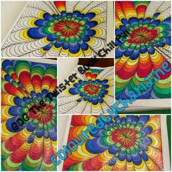
Mijn eerste  tekening uit dit kleurboek is van Arthur Santiago Quirat . Ik wilde graag stift en kleurpotlood gebruiken en gelpennen. Dit is een hele drukke tekening. Er gebeurt van alles. Een zoekplaatje in de tekening al kleurende eigenlijk. Zo een hele drukke tekening heb ik zelf nog niet eerder gekleurd , dus zeker een uitdaging.

My 1st drawing is from  Arthur Santiago Quirat. I like to colour with pencils, markerpens and gelpens. A very detailed drawing, there is a lot going on, a bg challenge for me

Ik heb maped color peps kleurpotloden gebruikt . Ik vind dit fijne kleurpotloden met een leuke prijs ze vallen eigenlijk onder budget kleurpotloden.En ik heb kid couleur BIC stiften gebruikt. Ook een budgetprijs. Ik heb tot nu toe geen ervaring met deze stift dus ik zal mijn ervaring hiermee in het review benoemen. De gelpennen die ik gebruik is een combinatie van allerlei merken en zeker geen dure merken. Te koop bij action en lidl, zeeman en wibra. Ik hoopte door het kleurmateriaal goed te gebruiken sommige gedeeltes van de tekening er uit te kunnen laten springen.

 I used Maped Color Peps pencils, nice buget priced pencils, also budget are the Kid Colour Bic markers, First time that I will use them. My gelpens are also low budget. I hop that some details will pop up, by using different material. Hmm where to start…. With coloured pencil…

Ja….waar te beginnen? Ik ben eerst maar wat herkenbare dingen gaan aanzetten met kleurpotlood.

Daarna ben ik de gele pionnetjes met stift gaan inkleuren. Net als de schilden van de schilpadden en de bloemen. Toen kwam er al meer duidelijkheid voor mij in de tekening. Ik vond het echt heel leuk om al kleurende dingen te ontdekken in de tekening.

After that I did some yellow , the turtles and flowers, the drawing will become clear for me, nice to discover different items while I am coloring

Als laatste heb ik de glitterpennen gebruikt (bijv in de ketting om de duiker heen) . Glitterpennen kunnen nogal vlekken en moeten vaak wat langer drogen vandaar mijn keuze dit als laatste te gebruiken

At last I used sparkle gelpens (the chain on the diver). Watch out, they can give spots, wait untill they are dry, use it at last!

Ik vond de Maped kleurpotloden niet echt goed dekken op dit papier,  er zijn nog vezeltjes te zien (het papier komt nog door de kleur heen) . De BIC stiften doen het overigens goed op dit papier. Ze rullen niet ,drukken wel door (maar dat doen stiften vaak vandaar dat extra papier tussen 2 tekeningen). Het papier pakt de kleurafgifte goed, geen aanzet /strepen en je kan meerdere laagjes over elkaar aanbrengen. De glitterpen wordt niet goed geabsorbeerd door het papier, waardoor er strepen/rondjes ontstaan….de aanzet eigenlijk. Gelukkig zijn dit kleine oppervlaktes en valt dit niet echt op in het eindresultaat.

I did not like the Maped pencils on this paper, I still see the paper. The Bic markerpens work pretty fine, A little bleedthrough but that’s ok, no stripes and you can do more layers. The sparklepens did not absorb well, but after drying it was fine for the small spaces

Ik vond dit echt een hele leuke tekening om te doen, juist vanwege het ontdekken van dingen tijdens het kleuren. Ik vind zelf ook dat ik er dingen wel heb kunnen laten uitspringen, zoals de duiker en de dieren( die ik eigenlijk niet eens in het begin heb gezien).

I really liked this project, because of discovering more and more details while colouring.

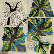
Mijn 2e tekening. Is van Casey (Keyesay)  Gilmore. Dit vind ik een zeer geschikte tekening voor kleurpotloden, naar mijn idee doet stift of markers de tekening geen recht aan.

Ik heb voor de tekening een duurdere kleurpotlood  gebruikt nl de ColourBlend van Spectrum Noir. Deze heeft 5 blikken “shade and Tone”, “Primaries”, “Florals”,  “Essentials” en “Naturals”. Ik heb de hele kleurpotlodenset en gebruik de kleurtjes door elkaar. Ik vind ze hele aparte/afwijkende kleuren hebben, in positieve zin. Voor de achtergrond heb ik CarbOthello pastelpotloden gebruik.

My 2nd drawing is from Casey Gilmore, I really believe this drawing needs coloured pencils and I choose some more expensives, the Spectrum Noir Colourblend. The set has 5 different boxes, “shade and Tone”, “Primaries”, “Florals”,  “Essentials” and “Naturals”, and I used them all, because of there unusual colourtones. For the background I used Stabilo Carbothello pastelpencils.

De kleurpotloden dekte niet gelijk, ik zag duidelijk het papier er nog doorheen komen. Na 3 lagen heb ik de 4e laag harder aangezet en toen dekte het. Dit zijn wat men noemt “zachte” potloden.

  
The pencils did not cover right away, after 3 layers, I did the 4th with some extra pressure and than it was fine for me.

Doordat dit zachte potloden zijn vlekken ze snel als je met je hand er over heen gaat tijdens het kleuren. Ik heb  een vel papier onder mijn hand gelegd, toen ik dit ontdekte ,om erger te voorkomen. Met een kneedgum heb ik het wel kunnen “opdeppen”

Because of the softness of those pencills I used a paper under my hand, to not smudge my work

De achtergrond heb ik met pastelkleurpotloden van Stabilo gedaan, de CarbOthello en de bijgeleverde doezelaar.  Ik vind dit achteraf gezien geen weerwaarde hebben gehad. Ik was te enthousiast met aanzetten en daardoor werd het niet mooi. Ik heb geprobeerd het weg te gummen maar scheurde daardoor het papier, ik heb dat proberen te herstellen met plakband. Zonde!

Deze tekening heb ik wel met fixatiespray behandeld om afgeven te voorkomen. Al met al is het wel een hele leuke romatische tekening geworden.

The background I did with Stabilo Carbothello pastelpencil and a paperstump. I made a mistake myself, it gave not some extra I was to enthousiastic ad I did not like it. I tried to rub it of, but my paper ruined, tried to cover with tape… what a petty! I protected my colouring with a fixative spray. I like the romantic style of the drawing.

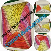
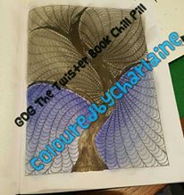
Mijn 3e tekening is van Alfred E Villanueva, de dragonfly. Ik had eerlijk gezegd een andere tekening uitgezocht maar op een kleurgroep vroeg men of we insecten wilde kleuren, ik ben dus gaan kijken of er in dit boek een tekening met een insect stond en dat was het geval.

Ik gebruik hier de Stabilo Carbothello voor, pastelkleurpotloden. Dit is pastelkrijt in een potloodvorm. Ik heb nl nog geen tekening alleen met dit materiaal gemaakt. Kneedgum heb ik bij de hand, je kan dit materiaal nl met kneedgum makkelijke opdeppen en daardoor uitvegen. En ik gebruik de bijgeleverde doezelaar.

My 3rd drawing is from Alfred E. Villanueva a dragonfly. I did choose another drawing but some asked to color a insect, so I looked for it. I use the Carbothello pastelpencils. I never did a drawing with only pastelpencil. Kneaded eraser in the neighbourhood for smoothing and erase, also use the paperstump.

Eerste met pastelpotlood iets kleur aangezet aan de randen en dit met de doezelaar verder de vleugels e.d ingeveegd. Pastelpotlood vlekt enorm als je er met je hand overheen gaat dus ik heb onder mijn hand een papiertje gedaan zodat ik wel vrij over de tekening kon blijven bewegen. Eigenlijk is het het handigst om als je rechtshandig bent, links bovenin te beginnen en dan naar de rechterkant te gaan werken  en van boven naar beneden. Maar zo gestructureerd  kleur ik niet. Ik ga van hot naar her.

Is het nodig om kleur op te nemen wrijf dan niet maar dep, met je kneedgum. .Je kunt met je kneedgum ook deppen in gekleurde vlakken om licht in je tekening te krijgen. Je kan kneedgum zo smal maken als je zelf wilt voor kleinere oppervlaktes of foutjes. Of juist heel breed….voor grotere vlakken of om verpoederd materiaal op te nemen. .

Use some little colour and smooth it with the paperstump,  use a paper under your hand to noot ruin your colouring, pastel mars. It should be the best to start in the corner left above and work downside, but I am not that organised colorist haha. Dab with your kneaded eraser, you can form it the way you want, and it takes of your pastel colour or crumbs pretty easy. Use the paperstump to “push” your color in the small edges, for bigger spaces I blend with my fingers.

Om kleinere oppervlakte in te kleuren( door het materiaal “uit” te vegen) na aanbrengen heb ik de doezelaar gebruikt en voor de grote oppervlaktes mijn vingers. Ik ben heel tevreden over het de stabilo CarbOthello.

Ik vond het heel leuk om deze tekening in te kleuren met dit materiaal. Het moet wel heel goed gefixeerd worden met Fixatiespray. Ik heb helaas teveel / te nat gewerkt met de spray waardoor er kleur heeft afgegeven op de volgende tekening. Een leer voor de volgende keer. Dus of hele dunne laagjes sprayen en laten drogen of je papiertje er nog achter laten zitten als je gaat fixeren. De punt van de doezelaar na gebruik goed schoonmaken. Ik duw de punt  diverse keren in de kneedgum en ga er langs papier mee tot er geen kleur meer afkomt, maar je kun de punt van de doezelaar ook langs een schuurpapiertje halen.

I am very happy with my Carbothello pastels, don’t forget that you have to use a fixative spray to protect your work… be darefull with the spary, use to much and you will stamp your colouring on the next page! I learned that I should not remove my protectionsheet, while I am spraying! Better use thin layers…. I clean my paperstump by pushing it into the kneaded eraser, go over a paper or use sandpaper.

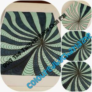
Mijn 4e tekening uit dit kleurboek is van Laurie Beauchamp.

Ik gebruik nog een keer de  Stabilo CarbOthello en glitterpen (voor de bloemenhartjes). Ik vond dit materiaal bij de vorige tekening goed bevallen en wil graag kijken of “ priegelen” (dus veel kleine oppervlaktes)  met pastelpotloden ook fijn werkt. Ik gebruik nu naast de doezelaar ook wattentips/stokjes. Dit omdat dit het poeder wat zachter uit wrijft dan de doezelaar, met name op wat grotere oppervlaktes die voor met je  vinger uitvegen  net weer wat te klein zijn. De doezelaar kan dan nl krassen maken.

My 4th drawing is from Laurie Beauchamp and I will again use my Carbothello and sparkle gelpens. I liked it in the colouring before, and now I like to know how it works in detailled drawing. I also use cottonballs and tips to colour. It works fine for the smaller spaces, no scratches from the paperstump, and better than my thick fingers sometimes.

Ik zet eerst met de potloden de kleur aan op de lijnen waarna ik de kleur verder uitwrijf met de doezelaar of wattentip. Pak voor iedere kleur wel een nieuw wattentipje, of maak je doezelaar eerst schoon voor je verder gaat met een andere kleur ivm onbedoeld kleuren mengen. Doezelaars zijn overigens in allerlei diktes te koop. Men adviseert voor iedere kleurtint er 1 apart te gebruiken.

I first make some coloured lines that I ru into the paper with a paperstump or cottonball. use more for the different colourpallets, or you have to clean them inbetween. Advice, take care of a set!

Ik heb zoveel mogelijk van links naar rechts en van boven naar beneden gewerkt. Maar toch vlekt het enorm,  dus papier onder de hand. Het materiaal vlekt zo dat het blanco a4tjewaar mijn hand op ligt aan de onderkant ook kleur/pigment opneemt van de tekening. Maar vlekken doet het in ieder geval niet meer. (Tip van Johanna Ans, fixeer tussendoor, je kan er gewoon overheen kleuren, scheelt een hoop onnodige vlekken)

I worked as much as possible from left to the right, from aboce to the lower part. Put a paper under your and so it will not take of your color. (tip from Johanna Ans, use your fixative spray inbetween, thin layer, dry color and go on!)

Ik heb er, mede door het materiaal, een lief draakje van gemaakt. Ik had alleen net zo goed een wat zachter kleurpotlood kunnen gebruiken ipv de CarbOthello, vind ik zelf. Ik zie er geen meerwaarde in. Combineren met kleurpotlood is echter wel leuk denk ik. Ik had het lijf en de achtergrond en de “ring” bijv met pastelpotlood kunnen doen en de  rest (bloemetjes,  gezicht van de draak en vogeltjes) met kleurpotlood. Maar ik ben overigens wel tevreden over het eindresultaat hoor, daar niet van!

I made a sweet dragon, also because of the material. I only think, that I just had to use a soft coloured pencil to get the same result. maybe I wil combine the next time. I could have done the background and the “ring” with pastels and the rest (flowers, face of the dragon, birds) with regular pencil, but I am happy with the result. 

Ik vind GDG Annual Colorists Collection Volume 1 een geweldig kleurboek.   Door de verschillende artiesten en hun eigen manier van tekenen  is er voor iedereen wat wils, naar mijn idee. Daarbij kan je kan met allerlei materialen in dit kleurboek werken van goedkoop tot duurder. Leg voor de zekerheid wel altijd een vel papier achter de tekening om de volgende tekening te beschermen. Het is zeker niet nodig duur materiaal te gebruiken om leuke resultaten te krijgen. Het papier houdt zich goed. Als je met stift werkt kun je beter wel de eerste laag goed laten drogen voor je een andere kleur gaat gebruiken. Heel nat werken is sowieso niet goed voor papier. Achterin het kleurboek heb je nog wat pagina’s om je materiaal uit te proberen of kleuren te mengen voordat je dat op je tekening gaat doen.

I like GDG Annual Colorists Collection Volume 1 very much. Different artists, different styles. You can use almost whatever you like IF you use a protectionsheet between the pages. It is not needed t have expensive material, the low budget stuff works fine too. Take care with your “wet” materials, let it dry inbetween your layers. At the end of the book, you have some pages to try your materials, or blend some tests.

Thank you very much Margreet for yur gorgeous review, so you like to see more of Margreet Kleurde, than follow her on Facebook : https://www.facebook.com/margreetkleurde or Instagram: @margreet_koelewijn

Annual Colorists Choice Collection Volume 1: Adult Coloring Book Global Doodle Gems Ultimate Collection

ColoristChoice_1Ultimate Global Doodle Gems Adult Coloring Collection… Chosen by colorists ! We had a huge nomination round on our Global Doodle Gems Coloring Group, colorists nominated their favorite drawings by submitting their colored pieces from the Global Doodle Gems Books published from the first year July 2015 to April 2016. Over 500 Drawings were nominated for the book. We had a Jury of 7 Judges from the large Coloring Groups, vote on their favourites and here is the result, We hope you will enjoy it ! The Cover was colored by Vero Pignot and the colored piece on the cover was chosen from all the nominated colored pieces… then Vero was asked to color the back with the portrait of Maria Wedel, the founder of Global Doodle Gems, in the same style. Cover drawings are by Orbleu’s and Alfred E. Villanueva. And a few lines from each of our Judges. Cynthia Elhorst, the owner of the biggest online Coloring for Adults community in the Netherlands. It was a pleasure to judge the collection and can’t wait to see the book! Curious about us? See our website http://www.kleurvolwassen.nl. Linda Op ‘t Eijnde, the other owner of Kleuren voor Volwassenen in the Netherlands. Together with Cynthia we allready own the website and community for allmost 2 years now. I liked the judging and can’t wait for the book. You can find us at https://www.facebook.com/kleurenvoorvolwassnen/ Deb Norman, i am the owner of 50 Shades of Colouring.. i enjoyed judging the wonderful talent that has come together to make this amazing book. Can’t wait to see it 🙂 https://www.facebook.com/groups/1639567539660887/ Angie Thompson, I am a huge coloring enthusiast! I am a HUGE GDG fan, having nearly all of the books in my collection! I love independent artists and supporting them. I can’t get enough coloring books or supplies–ever!! I also help admin the group, International Coloring Club, with my best friend- Vanessa Lee. Check our group out if you’re inclined: https://www.facebook.com/groups/1399664530361770/ Jody Estabrook, I am a reviewer. I met several of the ladies here in coloring groups. I started color because a friend told me it would help with my PTSD and she was correct! I color and review a lot of coloring books and mediums as I just can’t get enough!! My husband teases me all the time about having so many!! I found GDG when I bought The Who’s Whos and haven’t looked back!! https://www.facebook.com/Reviews-by-Jody-284752938390956/ #cherylcolors creator of Adult Coloring Worldwide. Colorist, Artist, Line Art Critic, Coloring Book and Artist Promoter. http://www.facebook.com/cherylcolors #anniecolors co-creator of Adult Coloring Worldwide and The Coloring Hangout. Colorist, coloring book and artist promoter. Find me here https://www.facebook.com/anniecolorsworldwide/


GDG Typical Dutch door Margreet Kleurde

Mijn naam is Margreet Koelewijn. Mijn hobby is kleuren,  en doe dit nu ongeveer  een jaar of 4. In die periode heb ik verschillende materialen om mee te kleuren aangeschaft.  Vanuit het GDG review team is gevraagd of we verschillende kleurboeken van Global Doodle Gems  willen uitproberen en er een review voor willen maken. In mijn geval wordt dit nu het kleurboek GDG Typical Dutch

My name is Margreet Koelewijn and my hobby is coloring, I color for almost 4 years right now. I bought my self different brands over the years. Got the question if  would help ding some reviews for Global Doodle Gems, and yes I will, and for now it will be Typical Dutch!

Het is een dik boek …..altijd fijn, net als dat de pagina’s enkelvoudig bedrukt zijn. Dit zorgt ervoor dat je met alle materialen kan werken zonder dat je de tekening op de achterkant verpest.

Typical Dutch is samengesteld door  de Nederlandse kunstenaars uit de GDG “stal”. Te weten  Johanna Ans, Arianne Schimmel, Peggy Sue Karunding Ellen Wolters, Sabine van Ee, Mireille Westerduin, Marieke Raterman en Inge Boogaers.  Dit kleurboek bevat typische Nederlandse gebruiken / taferelen door de ogen van deze kunstenaars gezien.

Vrij in het begin van het kleurboek staan over 4 pagina’s verdeeld  de tekeningen in het klein afgedrukt, zodat je al een overzicht krijgt wat je kan verwachten van het kleurboek. Iedere artiest heeft haar eigen gedeelte in het kleurboek. Aan het eind van het kleurboek zitten nog 2 pagina’s waar je kleurmateriaal of kleurencombinaties  op kunt uit proberen.

Ik heb  4 tekeningen uitgekozen omdat ik iedere tekening op een andere manier wilde inkleuren door verschillende materialen te gebruiken. Ik kijk dus eerst welke materialen ik wil gebruiken en daar zoek ik een tekening bij.

It is a big book, 64 drawings to color…always great, and the pages are single side printed so you can work with all kinds of stuff. Typical Dutch is a project from 8 Dutch artists, Johanna Ans, Arianne Schimmel, Peggy Sue KarundingEllen Wolters, Sabine van Ee, Mireille Westerduin, Marieke Raterman en Inge Boogaers. The boook has different typical Dutch idea’s, seen through the eyes of the artists.
In the beginning of the book are 4 pages with all the drawings in thumbnailsize, for a great overview what to expect. Also 2 pages in the back to try your material.  I first choise my material and than pick 4 drawings that I like to color.

Mijn eerste tekening uit Typical Dutch is een tekening van Marieke Raterman.  Het tulpenmeisje.

Ik gebruik de aquarelpotloden Mondeluz 72 van Koh-I-Noor voor deze tekening omdat deze tekening vrij grote oppervlaktes heeft en naar mijn idee daar goed geschikt voor is. Daarnaast hou ik zelf wel van het fee achtige en bloemen in tekeningen. De tekening heeft strakke lijnen, daar hou ik wel van. Ik doe voor alle zekerheid een a4’tje achter mijn tekening om de tekening die hierna komt te beschermen voor doordrukken.

My first will be the girl with the tulip from Marieke Raterman. I use KIN Mondeluz aquarel pencils, I think the drawing is perfect for the brand, small and big spaces to color. I love fairries and flowers, and the straight linework. Please think about your protectionsheet!

Met de Mondeluz  aquarel potloden kun je overigens ook gewoon kleuren dus je hoeft ze niet perse nat te gebruiken. Dat is erg leuk bijvoorbeeld bij het aanzetten of accentueren van bepaalde gedeeltes in de tekening. Deze aquarel potloden zijn wel moeilijker uit te gummen dan de gewone  kleurpotloden!

You know that you can color normal too with aquarelpencils? That is great to know when you like to put in some extra details after the watercoloring. Those pencils are not easy to erase!

Ik vind het nat bewerken met een waterbrush een beetje te nat worden en dan gaat het papier bobbelen. Ik kreeg een tip om met een dun penseeltje te gaan werken en dit in water te dopen. Daarnaast haalde ik het penseeltje nog over mijn hand voordat ik het op het papier aanbracht, ik vond dit op dit papier wel fijner werken.

Working with the waterbrush is to wet, I learned better use a small brush with water, get the extra water of the brush and than use it, works better for me.

Als je met laagjes wilt werken moet  je het papier echt goed  laten drogen anders gaat het rullen of nog erger….je maakt het papier kapot.

If you like to layer, take care of drying in between, you’re paper can get ruined

Ik heb zelf een achtergrond gemaakt. Maar daar zie ik achteraf de meerwaarde niet van in. Dat was dus helemaal niet nodig geweest.

I made a background my self, and after I did it, I thought, why? Because she did not need it at all!

Ik heb goed met de aquarell potloden kunnen “spelen” . Het was de eerste keer dat ik ze gebruikte en doordat de tekening uit niet al te priegelige stukken bestond kon ik goed oefenen. Ik ben , ondanks de achtergrond, wel tevreden met het resultaat.

I liked playing with the aquarell pencills, it was the first time that I used them and I am happy with the result.

Mijn 2e tekening uit Typical Dutch is de Hindeloopen tekening van Ellen Wolters geworden. Ik heb de Decotime markers gebruikt (die de Action verkoopt en daardoor staan ze ook wel bekend als de Actionmarkers). Deze zijn op alcoholbasis en drukken enorm door, dus ik legde wederom een a4tje achter de tekening. Dit bleek echter niet genoeg want er is helaas toch inkt doorgedrukt op de tekening hierna…dus de volgende keer minimaal 2 a4tjes ter bescherming.

My 2nd drawing is Hindeloopen (a small place in Friesland) from Ellen Wolters. Big background and I like to test if alcoholmarkers really will color without stripes and marks and they didn’t, teh Faber Castell Pitt Brush worked much better. I used the typical colors from Hindeloopen. The markers really do bleed, you see where I start to color, even after the 2nd time.

Ik heb voor deze tekening gekozen omdat deze tekening een grote oppervlakte heeft qua achtergrond. Ik wilde kijken of de markers inderdaad streeploos zijn na aanbrengen. In mijn geval dus niet. Ook bleken er een paar markers al uitgedroogd te zijn waaronder de kleur “cream”. Ik heb daarvoor in plaats de Fabercastell Pitt brush gebruikt.  Naast creme komt de kleur rood, groen en blauw veel terug in de Hindeloopen kunst terug (Hindeloopen is een dorpje in Friesland)

De markers vloeien erg uit op dit papier. De Fabercastell Pitt brush niet. Ik vind de aanzet van de brede punt van de markers duidelijk te zien en ook als ik er een 2e keer over heen ben gegaan. Dus ik vind de markers wel degelijk strepen.

Dit was de eerste keer dat ik met markers werkte dus het kan mijn techniek liggen. Maar ik vind het niet voor herhaling vatbaar.

Ik vond de tekening wel erg leuk om te in te kleuren , ik ging er ook zo in op dat ik helaas vergeten ben tussendoor  foto’s te maken waardoor ik alleen een foto van het eindresultaat heb.

It was the 1st time using Alcoholmarkers, and I did not like it, maybe it is my skills. I forgot to make wip shots in between, sorry!

Mijn 3e tekening uit Typical Dutch is het tafereeltje met de fiets geworden. Deze tekening is van Mireille Westerduin

Ik wilde graag wat diepte in een tekening  zien te bereiken door 2 materialen te gebruiken. Als je de hardere materialen (stiften in dit geval) voorin de tekening gebruikt  en de zachtere materialen (kleurpotloden) achterin, zou je diepte moeten bereiken in de tekening.  De fiets, het hout en de stenen  zijn in het echt ook van hard materiaal  dus vandaar dat ik voor deze tekening heb gekozen.

My 3rd coloring is the bike from Mireille Westerduin. I like to see some depth in my coloring so I will  use pens and pencills in this one. I used the markerpens for the bike, the wood and the stones. I used Maped colorpencills and Bruynzeel markerpens which are very wet, so be carefull for the second layer. When you get some stuff from the paper on your marker, clean it on some kitchenpaper!

Ik heb Maped kleurpotloden gebruikt  en Bruynzeel stiften. Beide zijn budget materialen. Maar ik ben normaliter zelf zeer te spreken over de Maped kleurpotloden.

Ik wilde de Bruynzeel stiften  uitproberen  op dit papier. Ik wilde nagaan of ze doorlopen (naast de lijnen) of niet en hoe snel ze drogen op dit papier. Deze stiften zijn erg nat, daardoor rult dit papier erg snel (met als gevolg vezeltjes op je punt)  en moet je het eerst echt laten drogen eer je er nogmaals over heen wilt gaan. Papier vezeltjes op de punt van je stift  kun je verhelpen door  met je punt over keukenpapier te gaan, de vezels blijven daar dan op.

Het papier absorbeert erg goed , hierdoor krijg je geen strepen. Dat vind ik wel erg fijn . Ik hou er niet van als je aanzetten en krassen ziet.

Paper absorbs pretty good, no stripes at all and I like that!

Met de Maped kleurpotloden heb ik de lucht en het gras gekleurd. Ik vond dit eigenlijk wel tegenvallen, ik vond het potlood op grote oppervlaktes “ hard “ kleuren en daardoor een krasserige resultaat geven.  Uit eigen ervaring weet ik dat dit niet zo is bij kleinere oppervlaktes.

The Maped pencills I used for the sky and grass, and was not that satisfied, it was a “hard” pencil that normaly works pretty fine on small spaces.

Of ik echt extra diepte in de tekening heb kunnen bereiken weet ik eigenlijk niet maar hetgeen wat ik er echt uit wilde laten springen is wel gelukt.

Don’t know if the depht that I wanted is reached, but I like the result!

Als 4e tekening heb ik het Boerenbont servies uitgekozen. Deze tekening is van Sabine van Ee.

Mijn favoriete materiaal is kleurpotloden. Deze tekening besluit ik met een duurder merk in te kleuren, de Faber Castell Polychromos, omdat ik bij de 3e tekening  goedkopere kleurpotloden heb gebruikt . Ik vind dit een goede tekening voor potloden. Kleine stukjes en ook wat grotere stukken en dat vind ik leuk voor kleurverloop.

The 4rd drawing is the Boerenbont pottery from Sabine van Ee. Colored with my favorite pencills Faber Castell Polychromos, the more expensive brand. They worked pretty good on the paper.

Op advies van mijn kleurmaatje Danielle heb ik de kleuren omgedraaid. Boerenbont servies bestaat uit creme met een gekleurd bloemenrandje. Zou ik dat aanhouden dan zou er naar mijn idee wel heel veel wit te zien blijven. Beetje saai dus eigenlijk.

My friend Daniëlle advised me to switch the original colors, the pottery is normally cream with colored flowers. That would be to boring for me.


Op de grote oppervlakte, in dit geval de theepot  en de kop en schotel, moest ik wel een blenderpotlood gebruiken omdat er anders nog teveel papier door de kleur kwam. Ik hou daar zelf niet van. Met een blenderpotlood wrijf je het pigment in het papier. Het wordt daarna wel moeilijker om dan nog een laag kleur er over heen  aan te brengen is mijn ervaring. Dus dit doe ik vaak als laatste.

For the bigger spaces I used a colorless blenderpencill. I do not like to much white spaces in my coloring, so a blender pencil will help you cover that. First do your colors, than your blending, because after that it is not easy to put on some extra color!

Dat je de papiervezeltjes nog ziet in de kleinere oppervlaktes vind ik zelf niet zo storend.

Ik ben zelf heel blij met dit resultaat. Ik hou er zelf erg van om realistisch te kleuren, dus het servies “omgedraaid” inkleuren was een uitdaging voor mij.

Normaly I color realistic, so this was a challenge for me, to turn around the original colors, but I am very pleased with the result.

Wat vind ik van GDG Typical Dutch?

Ik ben enthousiast.  Ik vind het heel leuk dat dit op Nederlandse taferelen /gebruiken is geïnspireerd. Ik vind het ook heel leuk om te zien dat iedere kunstenaar zo zijn eigen kenmerken heeft in het tekenen.  Daarnaast kan je dus met alle materialen in het boek werken, mits niet te nat en door een beschermend papier tussen 2 tekeningen te doen.

What do I think about GDG Tupical Dutch?

I am enthousiastic, very nice the Dutch inspiration. Also great to see that every artist has her own vieuw and way to draw, You can use all kind of material iff you use your protectionsheet and work not to wet! Like to see more of Margreet:

Volg Margreet op Facebook : https://www.facebook.com/margreetkleurde
of via Instagram: @margreet_koelewijn

Keibedankt Margreet voor je leuke en leerzame review!

typicaldutchThe first typical Dutch in the Global Doodle Gems line, in this book our Dutch artists are represented. The book brings together the Dutchie team. We take you on a journey through our country The Netherlands, from Kinderdijk to Amsterdam, via Hindeloopen to Delft. Of course our typical Dutch delicacies may not be missing, the herring bite, drop and foam blocks, pea soup with rye bread and of course our bitterballen. We are a land of mills and windmills, water and vistas and fixed habits like our Sinterklaas party. On the bike through the tulip fields is a typical Dutch occupation.We wish you lots of fun with your tour through our little country !
See all the pages in this video preview

There is also a Dutch edition available of this book
Typisch Nederlands: Kleuren voor volwassenen (Dutch Edition)


Artist of the day… Leen Margot Feathers & Dreams

Hi there Check out my Artist of the day featuring Leen Margot and her book Feathers & Dreams see my video below


features this lovely bookFeathers_and_Dreams_Cover_for_Kindle

get it here

FeathersAndDreams

GDG Teacup Treasures, Laurie Beauchamp, by Mimi Bezemer

1
Eerste indruk
De voorkant van het boek vind ik erg sprekend. De kleuren zijn erg mooi en kleurrijk. Het valt mij meteen op na dat wanneer ik door het boek heen blader er veel dieren in de theekopjes verwerkt zijn. En dit trekt mij persoonlijk erg aan. Ik heb erg veel zin om hier in te mogen gaan kleuren.

My first impression
I like the front, colors are nice and bright. When I go through the book, I see a lot of animals in a teacup, and I like it. I’m excited to start coloring.

Informatie over het boek / Info about the book

Tekenaar? artist: Laurie Beauchamp
Taal/ Language: Engels / English
Afmeting/ Size: 10x280x215 mm
Aantal kleurplaten / Number of designs: 36
ISBN: 9788793385825
Uitgever / Publisher: GDG – Global Doodle Gems

Review Teacup treasures
Als je het boek open doet zie je een leuke tekening van een kat in een theekop met de tekst “Te Cuties in this book belongs to” en daar kan je dan je naam onder schrijven . Als je dan omslaat naar de volgende bladzijde zie je wie je allemaal kan benaderen en op welke manier. De bladzijde erna staat een voorwoord geschreven door Laurie Beauchamp. En als je dan weer omslaat zie alle tekeningen in het “klein” getekend waardoor je precies weet en ziet welke tekeningen in dit boek getekend zijn. En dit vind ik persoonlijk wel erg leuk. Vervolgens kun je gaan kiezen welke tekening je wil gaan kleuren. Achterin het boek zie je ook weer “kleine” tekeningen. Deze komen uit het eerste boek van Laurie Beauchamp “Dazzling Dragons”. Deze zien er ook erg mooi uit.

Review Teacup Treasures
When you open the book yo see a drawing from a cat in a teacup with the text: “Te Cuties in this book belongs to” where you can write your name. The next page includes info about GDG and Laurie Beauchamp. After that the pages with the tumbnails so you can see what’s in the book, and I like that. Than you can make your chice. In the back of the book you see the Tumbnails of the other Laurie Beachamp book, “Dazzling Dragons”, those look cool too!


Eigen creaties
Ik heb 3 willekeurige kleurplaten gekozen uit het boek en wil graag deze laten zien.

De eerste tekening die ik gekleurd heb is met Ecoline – Brush pen gedaan. Het effect is wel erg grappig, maar het papier gaat een beetje bobbelen. Ik vind het dus niet geschikt om het in dit boek te gebruiken. Het is net of je met waterverf aan het verven bent. Het is niet zo dat het doordrukt, maar het papier wordt er niet mooier van. Maar wel een leuk resultaat geworden als zeg ik het zelf.

My creations
I choose 3 random pics from the book to color

The first drawing I colored with Ecoline-Brushpens (Ink on waterbase). The effect is funny, but the paper bubbles a bit. It was not the best idea to use, it is like painting with waterpaint. It does not bleedthrough, but it is not that good for the paper. But I do like the result!
14

De tweede tekening heb ik gekleurd met Stabilo 68 stiften. Ik vond dit erg prettig om mee te werken. Drukte niet door, het papier bleef netjes zoals het moest plat liggen. De  kleur werd mooi en goed opgenomen. Ik ervaar dit als zeer prettig om met deze stiften in dit kleurboek ermee te kleuren.

The second drawing I colored with Stabilo 68 pen. I really liked to use them. No bleed through, paper kept great and the colors became nice and bright. I like to use the pens in this coloringbook.
32
De derde tekening die ik heb gekleurd is met Stabilo 88 fineliners. En ook dit werkt zeer prettig. Sommige kleuren drukken heel licht door, maar dat is te verhelpen door een papiertje er tussen te leggen zodat de andere tekening niet wordt geraakt. Ik vind deze ook qua kleur erg goed gelukt en ik raadt ook aan om kleine details van de tekeningen met fineliners te doen. Geeft een erg mooi effect.

The 3rd drawing I did I used Stabilo 88 fineliners, and those work pretty fine too! Some colors a little bleed through, but that’s no problem, put a protection sheet between the pages. I like the way I colored and it’s a good choice to use the fineliners for the small details. A great effect!
50

Mijn mening
Ik vind het een erg mooi boek. De tekeningen vind ik ook erg mooi en het nodigt mij erg uit om er in te gaan kleuren. De moeilijkheidsgraad in de tekeningen zitten er ook in. Deze ene is moeilijk en de andere is iets makkelijker om te kleuren. De dieren die er in getekend zijn vind ik ook erg mooi. Het materiaal waar het boek van gemaakt is, is voor zeer veel materialen te gebruiken. Denk hierbij aan kleurpotloden, stiften, fineliners, ecoline stiften, waterverf enz. En dit komt omdat de tekeningen enkelvoudig bedrukt zijn zodat je nooit een tekening die aan de achterkant staat verpest. En door er dan een papiertje tussen te doen heb je ook minder kans dat je de tekening die achter de kleurplaat zit waar je mee bezig bent verpest. Kortom ik ben heel enthousiast over dit boek en ik ga er zeker nog meer in kleuren. Ik wil dit boek dan ook waarderen met het cijfer 8.

My opinion
I do like the book, drawings are great and invites you to start. Different levels of coloring, some easy, others more detailed. I love the animals. The book is great for colorpencils, pens, fineliners, waterpaint etc, and thats because of the single side printed pages. Always use a protection sheet! Fina, I am very excited about the book, and iI will color more! Ths book deserves an 8.

Het gehele kleurproces… the whole process of coloring

Thank you very much Mimi for your contribution! Wanna see more about Mimi, visit her page Mimi Creatief

Want to know more about the book, visit booklaunch Teacup Treasures

Voor meer informatie:

facebook: www.facebook.com/group/globaldoodlegems/

Twitter: ……@globaldoodlegem

Instagram: @globaldoodlegems


You blogger Johanna Ans for Global Doodle Gems


GDG “Twister Book Chill Pill” vol.1 by Maria Wedel, review by Charlaine Dingemans

Mijn eerste “echte” review. Mijn bevindingen over een boek van Global Doodle Gems. 

Het boek heet GDG “The Twister Book Chill Pill”. De platen in dit boek zijn getekend door Maria Wedel. Maria Wedel is de publisher van GDG. Ze heeft meerdere boeken op haar naam staan, o.a. een deel 2 van GDG “The Twister Book Chill Pill”. Hieronder wat foto’s van de boeken en natuurlijk van het boek dat ik ga reviewen voor jullie.

My first “real” review ever, my experience in a Global Doodle Gems Book!
The book is called GDG “Twister Book Chill Pill”, drawn by Maria Wedel. Maria Wedel is also the publisher from GDG. She has more books on her name, like vol 2 GDG “Twister Book Chill Pill”. I show you some of her books, and of course tell you about my book to review.
1
http://booklaunch.io/globaldoodlegems/twisterchillpill1
maria-wedel-pocket-twister-volume-1
http://booklaunch.io/globaldoodlegems/pockettwisterchillpills
maria-wedel-twister-chill-volume-2
http://booklaunch.io/globaldoodlegems/twisterchillpill2
maria-wedel-twist-a-dala-volume-1
http://booklaunch.io/globaldoodlegems/twistadala

Het boek GDG “The Twister Book Chill Pill” is  een mooi dik boek met 50 platen erin. De voor en achterkant zien er vrolijk uit, je wordt er echt blij van als je het ziet. De cover is gekleurd door Ellen Wolters. Zo kun je al gelijk ideeën op doen over hoe je je platen kleur gaat geven. De platen zijn ondanks hetzelfde thema toch erg divers. Hier onder een foto met wat platen uit het boek.

The book GDG “The Twister Book Chill Pill” is a nice and thick book with 50 drawings. The cover looks pretty happy and is colored by Ellen Wolters. It gves you an idea how to give color to the drawings. The drawings are pretty diverse even if the look almost simular in the first place! Show you some examples
7

Ik vond het wel moeilijk om te beginnen in het boek.  Er staan zoveel leuke platen in en je hebt zoveel mogelijkheden om ze mooi in te kleuren. Maar met welke plaat zou ik gaan beginnen en met welk materiaal? Na lang wikken en wegen heb ik eindelijk een keus kunnen maken. Wat kan dat moeilijk zijn he, kiezen waar je gaat beginnen.

It was hard for me to make a choice where to start. So many nice drawings and such a possibilities. Where shall I start and what brands to use? Finally I made my choice, it can be hard to make a good choice!

De eerste plaat heb ik gekleurd met de Bruynzeel Design potloden. Ik heb wat mooie kleuren uit gezocht en ben begonnen. Helaas merkte ik dat ik erg hard moest duwen om een goede mooie kleurafgifte te krijgen. Ik bleef ook witte spikkels zien in de plaat.  Dit is gelukkig op te lossen door na het kleuren met een blender potlood over je plaat te gaan.  Ik vind de kleuren mooi in mijn plaat, maar ben niet tevreden over de Bruynzeel Design potloden in dit boek. Misschien dat ander materiaal beter gaat?

The first coloring I dis was with Bruynzeel Design Pencils. I chose some nice colors, but they did not work that fine on the paper, I had to push hard, also white spots. You can change that by using a blenderpencil. I like my colors, but I am not happy withe how the Bruynzeel Design worked in this book…maybe another brand will go better?
2

Dus op naar de volgende plaat met ander materiaal. Ik heb mijn doosje Faber Castell Polychromos potloden erbij gepakt, en natuurlijk een blender potlood. Deze potloden gaan al beter op het papier. Ik vind dat deze platen in dit boek mooie heldere kleuren verdienen dus ik wilde een goede kleur afgifte en geen witte spikkels zien. Het blender potlood heb ik bij deze plaat ook gebruikt, maar het was minder nodig dan bij de eerste plaat. Het blenden gaat goed op het papier, het papier gaat niet stuk dus ik ben tevreden.

So go on to the next drawing, using Faber Castell Polychromos and a blenderpencil. Those work much better on the paper. I think the draings in the book deserve bright colors, so I want my brands to give fullspectrum colors and no white spots. Blending goed pretty good on the paper, so I am satisfied. 
3

Twee platen gekleurd met potloden maar ik wilde weten hoe het papier verder reageerde. En ik wilde ook gewoon nog meer kleuren in dit leuke boek. Ik twijfelde of ik het aandurfde, markers in een kleurboek. Maar ik was te nieuwsgierig en heb het gewoon geprobeerd. Voor de zekerheid wel een papier onder de plaat gelegd om de volgende plaat te beschermen. Ideaal dat de platen in dit boek enkelzijdig gedrukt zijn, je kunt gewoon kleuren waar mee je wilt. Ik heb gekleurd met de Decotime Twinmarkers van de Action en de paar Spectrum Noir markers die ik heb. De kleuren worden goed opgenomen door het papier, iets te goed misschien want blenden lukte me niet. Natuurlijk drukten de markers door op de achterkant van de plaat, maar dat is geen enkel probleem in dit boek. Het was zo leuk die mooie kleuren in dit boek, dat ik zelfs twee platen heb gedaan met markers. Heerlijk om niet hard te hoeven duwen maar gewoon de lijntjes te volgen in het boek.

2 Colorings done with pencil, but I want to know more on this paper, and I just like to do more, and I grabbed my alcoholmarkers. Of course used a protection sheet. It is ideal that it is single side printed, you can use whatever you want! I used Decotime Twinmarkers and some Spectrum Noir. Colors go on fine, maybe to fine because I had no time to blend. The colors where that nice, that I did 2 colorings with the alcoholmarkers. Of course they bleed through. Loved it just to color with no pushing!
5 4

De volgende plaat heb ik gekleurd met Lamy potloden en dat ging hartstikke goed.  De potloden geven mooi kleur af op het papier en je ziet amper witte spikkels. Goede potloden voor dit boek dus.

The next drawing I colored with Lamy Pencils and that worked damn good. Nice and bright colors, and almost no white spots. They are made for this book!
8

Tijdens het kleuren van de 5de plaat had ik al wat ideeën over de volgende plaat. Maar het was wel een gewaagd idee. Aangezien ik ook al met markers had gekleurd in dit boek, ging ik dit idee ook ten uitvoer brengen. Oost Indische inkt in een kleurboek. Ik heb mijn potje inkt erbij gepakt, die ik overigens nog heb vanuit mijn school periode, en dat is al even. Maar goed, aan de slag met inkt en een kwast. Eerst heb ik wat van de vormen in het boek gekleurd met de inkt. En dat ging verrassend goed. Ik heb natuurlijk wel een blad onder de plaat gelegd, maar dat was eigenlijk niet nodig. Het heeft niet doorgedrukt. Ja en dat was het einde van mijn idee. Verder was ik nog niet gekomen.  Dus even verder nadenken wat ik zou gaan doen. Het werden mijn Derwent Inktense krijtjes. Ik heb de kleuren nat aangebracht, met mijn kwast over het krijtje en verven maar. Dat ging ook hartstikke goed. Helemaal niet doorgedrukt en geen kapot papier. Dat gaat dus gewoon in dit boek. Hij was nog niet af mijn plaat.  Uiteindelijk nog met de Oost Indische inkt de lijntjes over getrokken en later nog met een witte gelpen. Ik ben tevreden met het resultaat.

When I colored my 5th drawing an idea started to do the next drawing, a great idea. I did already alcoholmarkers, and now I wanted to now how the Indian Black Ink would go. I have that ink from primary school time. So ink and brush it will be. Made some “linework” and than started to color… that was the start of my idea!…I had to think how to go on, and it became Derwent Inktense Blocks. Used my brush on the blocks and than colored on paper, and that worked great! No bleed through, no damaged paper, what a great book for this technique. I finished my coloring using a white gel pen and I am really happy with the result!
6

De inkt ging goed op het papier, dus ik kon er nog wel een doen met inkt. Ik heb gevraagd of mijn man een boom kon maken door de lijnen in de plaat te volgen. Hij heeft daar een soort van inzicht in. En de boom die ik had gemaakt is enorm mislukt. Hij heeft daarna met een witte gelpen nog wat leuke accenten aangebracht in de boom. Toen kreeg ik de plaat weer terug en na een nacht erover te hebben nagedacht besloten de rest van de plaat met pastel potloden te doen. Dat ging ook goed. Ik kon mooi het pastel uit wrijven. Dat ging dus ook gewoon in dit boek.  Eigenlijk kun je elk materiaal gebruiken dat je wilt.

The ink worked fine, so I wanted to do another one. I asked my husband if he could “see” a tree and make me that tree. The tree I made, was not that good, haha. He also made some white accents in the tree. After a night of thinking over I finished my coloring with pastelpencil. That worked great, I could smooth it pretty easy. I think, you can use whatever you want in this book
9

Wat de volgende plaat wordt in het boek weet ik nog niet, dat er een volgende plaat komt weet ik zeker. Je kunt echt creatief zijn met kleur in dit boek, hartstikke leuk.  Ja en dan zijn er nog een paar van dit soort boeken. Eerst maar dit boek helemaal kleuren, maar de andere boeken staan al wel op mijn verlanglijstje.

What will be the next coloring in this book, I don’t know yet, but there will be more for sure. You can be very creative with this book. There will be more of those books on my wishlist!

Wil je meer weten over Global Doodle Gems, er is een kleurgroep /colorgroup en een community

Thank you very much Charlaine for your contribution

Wil je meer weten over Charlaine dan kun je haar volgen op haar eigen pagina: https://www.facebook.com/colouredby… en op WordPress: https://colouredbycharlaine.wordpress.com/


GDG “Color It 2” by Ondine Summers, Margreet Koelewijn

Mijn naam is Margreet Koelewijn en ik heb me bij  Johanna Ans van Global Doodle Gems (GDG) opgegeven om  3 kleurboeken uit hun “stal” te kiezen en uit ieder kleurboek  minimaal 3 tekeningen in te kleuren.  Vervolgens schrijf ik dan mijn  ervaringen over het kleurboek ,de tekeningen en de gebruikte materialen in een review.

Mijn hobby is kleuren,  en doe dit nu ongeveer  een jaar of 3. Omdat ik een voorkeur heb voor kleurpotloden zie ik dit als een persoonlijke  uitdaging. Ik heb nl in de loop der jaren nog meer materialen om te kleuren verzameld. Aangezien het de bedoeling is om de tekeningen in te kleuren met diverse materialen “moet” ik de, voor mij minder voor de hand liggende materialen, nu ook gaan gebruiken. Daarnaast vind ik het ook heel leuk om mijn bevindingen op deze manier te kunnen  te delen met anderen.

My name is Margreet Koelewijn, and I had the invitation by Johanna Ans from Global Doodle Gems to choose 3 books, color at least 3 drawings from each book, and tell you about my experience, about the book, the drawings and my used materials. I love to color, and I color for about 3 years now. I love pencils the most, but I see this as a challenge to use other stuff too. I collected all kinds of brands the last years. I “must” use different stuff right now, besides that I like it to tell you about my journey!

Mijn 1e keus is het  kleurboek  GDG Colour It 2 van Ondine Summers  geworden. Dit omdat deze voorkant me echt “trok” ik hou nl van dit soort tekeningen. Dit kleurboek is geïnspireerd op haar werk als Tattoo Artist

My first choice is the book GDG “Colour It 2”, by Ondine Summers. The cover grabbed my attention, I love ths kind of drawings. This book is inspired on Ondine’s work as a Tattoo artist.
1

Ik werd zeker niet teleurgesteld. Er staan allerlei soorten tekeningen in, die voorin het boek staan in een overzicht. Er zijn oa tekeningen met bloemen, skulls, fantasie en  dieren. Voor ieder wat wils dus. Het boek heeft 25 kleurplaten en ze zijn enkelzijdig gedrukt. Er was al aangegeven dat het papier van GDG iets dunner is omdat het print on demand is (dit komt uit Amerika). De tekeningen zelf zijn erg duidelijk, de lijnen zijn strak en goed  aangezet. Achterin zitten 3 lege pagina’s, ik vind dit zelf handig om het materiaal en de kleurencombinaties op uit te testen, die je in het boek wilt gaan gebruiken. Ik heb zelf (uiteindelijk) 4 tekeningen uitgekozen omdat ik iedere tekening op een andere manier wilde inkleuren, door andere materialen te gebruiken.  Ik heb de 1e tekening met goedkopere materialen gekleurd en ik was daarna erg benieuwd hoe het duurdere materiaal dan zou kleuren en wat het verschil zou zijn. Vandaar dat de 4e tekening er bij gekomen is. Ik wist eerst welke materialen ik wilde gaan gebruiken en heb  daarna  de tekeningen uitgezocht.

I was not disappointed, not at all. All kinds of drawings, in the front of the book there is a thumbnail overview. You can choose flowers, skulls, fantasy or animals, everybody can fins something he likes. The book contains 25 drawings, single side print. They told me that the paper would be thinner than usual, but that is because of the print on demand service (I have books through the American Amazon). The lines are very clear and need. In the back 3 empty pages where you can try your materials, that’s a great idea. I chose 4 different drawings to color, because I want to color different ways. The first I colored was with cheaper brand, and I wanted to know also the more expensive brands, how they work. First I chose my brands, after that the drawings.

Mijn 1e tekening uit GDG Colour It 2 is de tekening met de luchtballon geworden

Start with my first coloring, the balloon
2

Ik wilde als eerste een combinatie van materialen gaan gebruiken. Aangezien ik niet zo ben van het combineren van diverse materialen leek dit me gelijk een goed begin en ook weer een persoonlijke uitdaging. Ik heb gekozen voor Stabilo 68 (stiften)en 88 (fineliners) en de kleurpotloden van Bruynzeel  uit het keverblik en de soft pastels van Van Eyck en gelpennen . Bijna iedere kleurder begint met deze Bruynzeel kleurpotloden omdat deze niet duur zijn en een goede kleurafgifte hebben. Dit was dus ook mijn eerste aanschaf. Maar de eerlijkheid gebied me te zeggen dat het heel lang geleden is dat ik met deze kleurpotloden gekleurd heb.

First I wanted to make a combination of brands… not my usual kind of coloring, so it became a personal challenge. I chose Stabilo 68 pens and 88 fineliners, and the pencils from Bruynzeel Beetlebox, the softpastel from Van Eijck and gel pens. Almost every colorist in the Netherlands start with the Bruynzeel pencils, they are good, and not expensive. This also where my first pencils but I have to submit, it was a long tome ago that I used them
3

Ik kleur zelf niet zo graag met stift en zeker niet op grotere oppervlaktes  omdat ik altijd aanzetten blijf zien en dat niet mooi vind. Ik heb de stift dus voor de strepen gebruikt in de ballon  en de rondjes e.d. Naar mijn idee liep de tekening niet helemaal door in het patroon in de luchtballon, dus dat heb ik er zelf in getekend met de zwarte fineliner. Daarna heb ik de fineliners niet meer gebruikt. De stiften drukten wel door op de achterkant en de fineliner iets. Op zich geen probleem aangezien het papier enkelzijdig bedrukt is  en als je een vel papier aan de achterkant van je tekening legt bescherm je de volgende tekeningen tegen eventueel doordrukken. Voor de strikken op de luchtballon heb ik een gelpen gebruikt.

I don’t like to color with pens, specially not on big spaces, because I don’t like the start of the ink. I used the pens just fr details. My oppinion, the lines where not totally closed, so I draw my own lines. Pens bleed through a little, no problem because the paper is single side printed and I used a protection sheet. I used gelpens on the ribbons.
4

De grotere vlakken in de luchtballon heb ik  met kleurpotlood gekleurd, net als de mand en berg en dal. Ik heb als laatste de achtergrond  met soft pastels gekleurd. Dit was de eerste keer dat ik dit materiaal gebruikte. Ik heb met een mesje wat van krijt afgeschraapt op een schoteltje en heb met een watje wat krijt opgenomen en zacht ingewreven op het papier. Daarna heb ik een wattenstaafje gebruikt ipv een watje en dat vond ik prettiger gaan. Mijn ervaring met dit goedkopere (budget) materiaal in dit kleurboek is zeer positief! Ik gleed over het papier, ik heb niet hoeven doezelen, blenden  of iets dergelijks.  Alles werd goed opgenomen  door het papier en er liep niets door, ook al is het papier dan wat dunner.  Ik heb niet diverse lagen over elkaar moeten zetten om schaduw of iets dergelijks te creëren, gewoon  iets harder drukken op het kleurpotlood was al voldoende. De soft pastel krijtjes vond ik ook heerlijk kleuren al is het is wel wat bewerkelijker dan pastelpotloden, maar voor die prijs klaag ik echt niet. Ik ben in totaal ongeveer 2 uur bezig geweest met deze tekening, voor mijn doen is dat erg snel. Ik had dat al kleurende niet door en ik vond het eigenlijk jammer toen ik klaar was. Ik ben erg blij met dit resultaat en dat met goedkoper materiaal! Mijn Bruynzeel potloden gaan in ieder geval niet meer onder in de stapel.

De bigger spaces I colored with pencils, the background with softpastel, the first time I used that brand! I rasped some crayon on a plate and used cottontips to color. My conclusion, the cheap brands work pretty fine on the paper! Did not need to use other techniques. All color became nice on paper, just by pushing a little, The pastels worked pretty good, I little more work than using pastelpencils, but I liked it. In total I worked 2 hours on the drawing and that’s pretty fast for me… te Bruynzeel pencils will not be on the bottom anymore…

Mijn 2e tekening uit GDG Colour It 2 is een Skull geworden. Ik heb daarvoor de Stabilo 68 (stiften) en gelpennen van United Office gebruikt. De gelpennen zijn zeker niet duur en de Stabilo’s liggen in de middenklasse qua prijs. Ik vind ze echter veel fijner kleuren dan de goedkopere stiften die ik heb. En je kan ze ook met water gebruiken waardoor de kleuren zachter worden, maar die techniek heb ik niet gebruikt in deze tekening.

My 2nd drawing from Colour It 2 became a skull. I used Stabilo 68 pens and gel pens from United Office. The gel pens where cheap and the Stabilo is a middle class prized brand, but I like them the best. You can also use them with water as in aquarel, but I did not do that.
5 6 7

Ik moet eerlijk bekennen dat dit niet echt tekeningen zijn waar ik van hou. Maar ik heb voor deze tekening gekozen omdat ik dit een ideale tekening vind voor stiften, niet te grote oppervlaktes . Voor potloden vind ik zelf dat de oppervlaktes net weer wat te klein/fijn zijn, dat vind ik dan  teveel “priegelen” worden. Omdat ik weet dat de stiften doordrukken leg ik een papier achter de tekening, om de volgende tekening in het kleurboek te beschermen.

I have to tell you, this is a drawing that I normally do not like. But I colored it because of the great spaces, ideal for pens. I think myself for pencil just to fine for me. I use my protection sheet of course
8 9 10

Je kunt op dit papier een 2e keer over dezelfde  kleur heen gaan om zo een donkere kleur te krijgen of een schaduw. Dit is te zien bij het begin en einde van de takken.  Een 3e keer durfde ik echter niet aan, bang om het papier te laten rullen.  De gelpennen heb ik als laatste gebruikt omdat ik de ervaring heb dat het anders gaat vlekken als je er overheen wrijft met je handen, of er overheen gaat met ander kleurmateriaal, en zo dus je tekening kan verpesten. Ik heb de stiften  voor een groot gedeelte van de tekening gebruikt, nl voor de rozen, bladeren en de takken en de skull zelf. Het kleurverloop op de rozen heb ik met 3 verschillende  kleuren gedaan die dicht bij elkaar liggen in tint, en hier en daar een klein stukje wit gelaten. Op de skull zitten diverse versieringen waar ik de gelpennen voor heb gebruikt zoals de gouden en zilveren tanden, de stippen, het kruis, en de geschulpte randjes langs ogen en neus, en de versieringen naast/achter  de blaadjes.

You can use your pens twice on the same spot to shade. A 3rd time was a no go for me, scared to ruin the paper. I used the gel pens at last, because my experience is that they can fade out, and I don’t want to ruin my coloring. I used the pens the most for this drawing, the roses in different close together colors, the leafs, the tree and the skull itself. I used the gelpens for details on the skull, the teeth, the dots, the cross and the lines on the eyes and nose. 
11

Mijn ervaringen met het materiaal en het papier zijn wederom positief te noemen. Ik vond het heerlijk kleuren, ik hoefde niet op te letten of de stift vlekte als ik er met mijn hand overheen ging omdat het zo snel intrekt dat het dat gewoonweg niet doet. Ook deze tekening was onverwachts snel klaar. En ondanks dat dit een persoonlijke uitdaging was in verband met het materiaal wat niet echt mijn voorkeur heeft, net als het soort tekening , vond ik het toch wel een leuke tekening om in te kleuren en ben ik zeker tevreden met het resultaat.

Again a positive experience, the ink dries very fast! I loved it how the pens worked on the paper. Finished pretty fast, and even if it was not my kind of drawing I am really happy with the result!

Mijn 3e tekening uit Colour It 2 is deze Halloween tekening geworden. Ik vond dit, bij het doorbladeren van het kleurboek, al gelijk een hele leuke tekening en wist ook dat ik hierbij de  Derwent Inktense potloden wilde gaan gebruiken . Deze potloden worden na het aanbrengen met water bewerkt met een penseel of waterbrush, waardoor de kleuren heel intens worden. Deze potloden zijn niet goedkoop maar ik vind het heel leuk om hiermee te werken, juist omdat het zulke intense kleuren zijn. Je moet natuurlijk wel nagaan of je met dit materiaal in je kleurboek werken kan omdat je het nat moet maken en dat kan niet bij al het papier.

My 3rd drawing from Colour It 2 became a Halloweendrawing. When I flipped through the book, it already got my attention and I knew that I would try my Derwent Inktense on this. Using them with water and a brush or waterbrush, the colors will be great! They are not cheap but gorgeous to work with…and I wanted to test the paper of course!
12 13 14

In dit kleurboek heb ik alle lagen goed moeten laten drogen omdat ik te snel wilde verder gaan, ik het papier bijna kapot maakte.  Ondanks het goed laten drogen vind ik wel dat het papier opbolt bij gebruik met water. Ik vind het overigens niet echt storend. Sommige aanzetten heb ik direct vanaf het potlood gedaan, door met de vochtige gedeelte van het penseel,  het potlood aan te tippen en het dan op de tekening aan te brengen.  Dat gaat dan echt om hele dunne lijnen, als schaduw of omdat het inkleuren en daarna nog moeten bewerken met water voor uitlopen zou zorgen (en dus buiten de lijnen terecht zou komen)

I had to take a brake between my work, because I wanted to go to fast, you have to be carefull and give the paper the change to dry! The paper will be a little bubbled using water. I used my brush on the pencil it self, to make smaller lines, or shade. This because I did not want the color go over the black lines.
16

Ik kreeg de tip om in plaats van met de waterbrush,  met een penseeltje  te gaan werken. Met die tip   was ik heel blij. Ik kon veel preciezer werken  en het papier werd niet zo vochtig, ik haalde nl de penseel langs me hand voordat ik het op het ingekleurde gedeelte aanbracht (de bomen in dit geval). Voor de vleermuizen heb ik een zilverkleurige gelpen gebruikt en voor de bezem van de heks en de soort waterdruppels een goudkleurige  gelpen. Ik ben blij met het resultaat. En ook deze tekening kleurde ”lekker weg”. Doordat je en inkleurt en het daarna nog met water bewerkt kost het wel meer tijd dan alleen kleuren met kleurpotloden of stiften. Maar dit is wel 1 van mijn favoriete kleurtechnieken.  Je kan niet te nat werken en moet de lagen echt goed laten drogen eer je verder gaat, om opbollen en rullen van dit papier te voorkomen.

Somebody gave me the advice to use a brush instead of a waterbrush, that goves less water, and is much better for the paper, and the result! I used gelpens for details and I am very happy with the result. It gave me fun coloring, takes more time because of the aquarel technique but it also is one of my favorite ways to color. Take care using not to much water, and give the ink the time to dry between the different layers.

Mijn 4e tekening uit Colour It 2 is de vogel met de klok geworden. Ik wilde toch ook graag kleurpotloden van een duurder merk uitproberen in dit kleurboek. Dat zijn de Derwent Coloursoft geworden. Dit zijn vrij zachte kleurpotloden en daarom werk ik hier meer in laagjes mee dan harder drukken op het potlood. Hard drukken op dit potlood moet je zien te vermijden omdat anders de punt afbreekt. Ik vond dit een hele schattige tekening, en erg geschikt voor kleurpotloden.

My 4th drawing became the bird with the clock, I also wanted to use some more expensive stuff and it became Derwent Coloursoft. Soft pencils, perfect to layer with.. Don’t push them, because they will get hurt! I like the cuteness of the drawing, and I think it is perfect for pencils!
17 18 19

Op dit papier dekte de Coloursoft niet zo goed als de Bruynzeel.  Dit vind ik niet storend als je door middel van laagjes opbouwen een verloop van een donkere naar lichtere kleur wilt bereiken (zoals bijvoorbeeld bij de schaduw in het uurwerk van het horloge). Ik heb hierbij wel dezelfde kleur gebruikt maar dus in meerdere lagen gewerkt.

The Coloursoft did not cover as how the Bruynzeel did, but that was ok, I layerd more to reach light to dark color, as I did in the clock, using just one pencil.
20 21

Bij de bloemen had ik echt meerdere lagen nodig en heb ik met meerdere kleuren gewerkt . Als laatste eindigde ik met een lichter potlood, om er mee te blenden om het dekkend te krijgen (om geen witte spikkels  van het papier te blijven zien). Ik vind het wel storend als ik “witte spikkels” er door heen zie komen.

I needed more layers on the flower, and I used more different colors. I blended my coloring with a lighter color, I don’t like to see the white spots in between.

Ik vind Colour It 2 een geweldig kleurboek. Ik vind zelf alle tekeningen het inkleuren waard.  En door de verschillende “thema’s is er voor iedereen wat wils, naar mijn idee. Daarbij kan je kan met allerlei materialen in dit kleurboek werken van goedkoop tot duurder en ook met water. Leg voor de zekerheid wel altijd een vel papier achter de tekening om de volgende tekening te beschermen. Het is zeker niet nodig duur materiaal te gebruiken om leuke resultaten te krijgen, want eerlijk gezegd  vond ik dat, in dit kleurboek, het goedkopere materiaal fijner kleurde dan het duurdere. Voor nu gaat Colour It 2 van  Ondine Summers dicht, maar ik zal dit kleurboek vaker pakken en misschien wordt het wel mijn eerste kleurboek dat volledig ingekleurd word!

I love Colour It 2, really like the drawings. For everybody something nice because of the different kind of subjects. You can work with all kind of materials, be carefull and use always a protection sheet. It is not needed to have only expensive brands, to be honest, my cheaper brands worked much better than the expensive! For now, I close this book Colour It 2 by Ondine Summers, but I could be my first book that I will color all!

Wil je meer weten over did boek, klick dan op onderstaande link
Want to know more of this book, click on the link below

Booklaunch Colour It 2 by Ondine Summers

Thank you very much Margreet Koelewijn for your contribution…want to know more about Margreet?
Follow her page Margreet Kleurde or on Instagram: @margreet_koelewijn

Translation done by your blogger Johanna Ans for team Global Doodle Gems
Join our FB fangroup, grab freebees, meet the artists!


Valentine!!! New GDG LOVERS…..

Today it’s Valentines day, the day that you think about your loved onces, your secret lover, or other kinds of love…. I wanna share the love for Global Doodle Gems books by our new Dutch Review team…. I will give you some quotes that I found on our secret group! But of course it is also about our GDG Valentines Collection, 3 books already! The team all bought a set of 3 books for a review, so they do know about our books, those Valentines drawings where a gift from me to the team….

Vandaag is het Valentijnsdag, de dag dat je denkt aan je geliefden, je geheime liefde of andere vormen van liefde…Ik wil met jullie de liefde delen voor de Global Doodle Gems boeken van ons nieuwe Nederlandse GDG Reviewteam…. ik geef je wat quotes die ik gevonden heb in onze geheime groep! Maar natuurlijk gaat het ook over onze GDG Valentijns Collectie, 3 boeken intussen al! Het team heeft allemaal een set van 3 boeken gekocht, dus ze raken al bekend met onze boeken, de Valentijnsplaten waren een cadeautje van mij voor hen….

Ik heb mijn team al mijn Valentijnsplaten gegeven die ik heb getekend voor de boeken, net een weekje geleden, omdat mijn idee laat ontstond…maar dat was geen enkel probleem…ze waren zo enthousiast dat ze gelijk aan de slag gingen. Ik heb wat quotes gekopieerd die er werden geschreven op de groep….

I gave the team all my drawings that I made for those books, just a week ago, because my idea came late… but that was not a problem at all…they where so enthusiastic and started to color for us! These are some line ups they wrote on the group….

Debby van Uem-Voortman Ik vind het een eer om hier aan mee te werken! En GDG verdient het ook om beroemd te worden in Nederland, want het zijn fantastische tekeningen van geweldige artiesten in prachtige boeken!

For me it is a honor te work on this! And GDG deserves to become famous in the Netherlands, because the drawings are fantastic from the great artists in gorgeous books!

Charlaine Dingemans Naring Leuke platen, heb ze opgeslagen en wil zeker mee doen. En idd een super uniek iets dat we al die platen krijgen van je

Nice drawings, I collected them all and I am sure to collaborate. And indead, it’s a unique thing that we get all those drawings from you

Janeska Van de Wijngaard Leuke platen! Wacht de pdf’s af om te starten. Ben door mee te doen aan dit team meer gemotiveerd om van iedere plaat wat moois te maken.

Nice drawings! I wait for the files to start. Because of being one of this team I am more motivated to make something beautiful from each drawing.

Is dat nu niet geweldig! Om inkleurders / reviewers zulke mooie woorden te zien schrijven? Ik word er zelf helemaal blij en vrolijk van. Het inkleuren nodigt zelfs uit mooie teksten te schrijven bij een plaat zoals Tabitha deed

Isn’t that great! To see that colorists / reviewers write such nice words? It makes me cheerful and happy. During the coloring people even write nice quotes with the drawing, like Tabitha did.
tabitha-wasbauer
Geniet van het leven en leef het met passie, ook als je je even in de schaduw bevindt…

‘Love life! Be passionate, even when it’s dark’.

En er is meer, nog meer lovende en lieve woorden,
And there is more, more nice quotes!

Cindy van Bemmelen Johanna Ans, Echt super leuk zo al die extra’s die we mogen doen!

Johanna Ans, really nice this that we may do all those extra things!

Mimi Bezemer Dat lijkt mij een eer en een leuke / bijzondere ervaring om hier aan mee te mogen werken. Doe graag mee

That seems like an honor to me and a nice / special experience to work on this. I am in

Margreet Koelewijn Ik kleur zeker meer en heb er meer plezier in. Dat komt vast ook door de diversiteit in de boeken. Ik zie overal wel een uitdaging in….in de tekening zelf of het materiaal. Erg leuk!

I color more, and have more fun coloring. I think it is because of the diversity in the books. I see a challenge everywhere…in the drawing it self or the material to use. Really nice!

Natuurlijk ga ik jullie ook laten zien wat het team de afgelopen week allemaal heeft ingekleurd, ik heb hun werk verzameld en er een video van gemaakt… Dit blog is ook een verrassing voor hen, want ik wil hen ook bedanken…. even benadrukken hoe ik hun werk waardeer en hun enthousiasme, hun blogs die al worden gemaakt en het delen van al hun werk wat ze hebben gedaan in de afgelopen weken!

Of course I want to show you what the colorist did last week, I collected there work and made a nice video of it…. This blog is also a surprise for them, because I want to say thank you to them too…want to tell how much I appreciate there enthousiasme, there work, there blogs and sharing of all the work they have done in just a couple of weeks!

Dank jullie wel GDG Dutch Review Team….. Thank you all!!!
Manuela, Tabitha, Karin, Debby, Mimi, Manuela, Cindy, Patricia, Margreet, Heleen, Charlaine, Janeska, Wendy, Stephanie & Hanny

Wil je meer weten over de Valentijnscollectie van Global Doodle Gems….Klik dan op de booklaunchlinken…
valentines-volume-1http://booklaunch.io/globaldoodlegems/valentines1

valentines-volume-2 http://booklaunch.io/globaldoodlegems/valentines2

valentines-volume-3 http://booklaunch.io/globaldoodlegems/valentines3

En als je dan toch iets meer over de Nederlandse geliefden taal wil leren…. ik vond dit op Youtube… en is gewoon leuk!

And if you like to learn some pretty nice DUTCH LOVE lessons… I found this on Youtube… and it is funny….

Tot ziens in het volgende blog!!! Oh, en ja, het team gaat ook kleuren voor de Paascollectie…Alle Nederlandse tekenaars die meegewerkt hebben aan GDG Easter Collection Volume 1 & 2, hebben hun tekeningen ter beschikking gesteld aan het Reviewteam. Dank jullie wel Peggy, Sabine, Ellen, Mireille, Inge en Arianne... Ik weet zeker dat er weer met veel plezier gekleurd gaat worden!

Untill the next blog!!! Oh, and yes, the team will also color for our GDG Easter Collection… All Dutch artists that are in the GDG Easter Collection Volume 1 & 2 send in there drawings to me to give to the team! Thank you Peggy, Sabine, Ellen, Mireille, Inge & Arianne…. I am sure the team will have fun coloring!

Your blogger Johanna Ans and GDG Dutch Review Team for Global Doodle Gems


GDG Typical Dutch by Mimi Bezemer, host review

Review GDG Typical Dutch

gdg-typical-dutch

Het eerste typisch Nederlands aan dit Global Doodle Gems boek,is natuurlijk het feit dat allemaal Nederlandse tekenaars zijn. Het idee ontstond het Dutchie team samen te brengen in 1 boek, de tekenaars en onze inkleurders! We nemen jullie mee op reis door ons Nederland, van Kinderdijk naar Amsterdam, via Hindelopen naar Delft. Natuurlijk mogen onze typisch Nederlandse lekkernijen ook niet ontbreken, het haringhappen, drop en schuimblokken, snert met roggebrood en natuurlijk onze bitterballen. We zijn een land van molens en windmolens, van water en vergezichten van vaste gewoontes zoals ons Sinterklaasfeest. Op de fiets door de tulpenvelden is een typisch Nederlandse bezigheid.

The first typical Dutch in this Global Doodle Gems book, of course, is the fact that we are all Dutch artists. The idea was to bring the Dutchie team together in one book, the artists and our colorists! We take you on a journey through our country The Netherlands, from Kinderdijk to Amsterdam, via Hindeloopen to Delft. Of course our typical Dutch delicacies may not be missing, the herring bite, drop and foam blocks, pea soup with rye bread and of course our bittterballen. We are a land of mills and windmills, water and vistas and fixed habits like our Sinterklaas party. On the bike through the tulip fields is a typical Dutch occupation.

Eerste indruk
Het valt mij meteen op hoe kleurrijk en hoe echt Nederlands het boek is. Als ik het boek snel doorkijk zie je echt veel herkenbaren tekenen wat echt Nederland kenmerkt. Zoals het kussende mannetje en vrouwtje, het Amsterdams paaltje, tulpen, molens en zelfs een gedeelte van het liedje “Zo gaat de molen”. Ik ben erg gemotiveerd om hier in dit boek te gaan kleuren.

First impression
It is the first thing to notice, how colorfull and how real Dutch this book is. When I take a quick vieuw, a lot of drawings to recognize, typical Dutch for me! Like the kissing couple, the Amsterdam sign, tulips, mills and even a part of the song “So goes the windmill”. I am very motivated to start coloring.

Informatie over het boek
Tekenaars/Artists: Johanna Ans, Arianne Schimmel, Peggy Sue Karunding, Ellen Wolters, Sabine van Ee, Mirelle Westerduin, Marieke Raterman, Inge Bogaers

Inkleurders/ Colorists: Karin Speijer – Kamp, Nancy van Acker, Wendy Hofstee-Wiersema, Carla den Otter, Wendy Danko, Manuela Bremer

Taal/ Language: Nederlands / Dutch

Afmeting/ Size: 10x280x215 mm

Aantal kleurplaten/ Number of pages to color: 66

ISBN: 9788793385818

Uitgever/ Publisher: GDG – Global Doodle Gems

Preview GDG Typical Dutch

Als je het boek open doet zie je alleen de titel van het boek, wie het getekend heeft. En als je daarna weer verder gaat kijken staat er op de volgende bladzijde iets verteld hoe je hun kan benaderen. Dat is oa via Facebook, Twitter, Instagram en een blog op WordPress. Op de volgende bladzijde wordt in het kort iets verteld hoe dit boek tot stand is gekomen en wie er allemaal aan meegewerkt hebben. Daarna zie je over 4 bladzijden in het klein de tekeningen die je eventueel kan gaan kleuren.  Wie het getekend heeft zie je op de linker bladzijde van het boek. En aan de rechter kant zie je de tekening. Achterin het boek zie je 2 bladzijden waar je zelf een soort kleurenkaart kan maken.

Preview GDG Typical Dutch

When you open the book, you see the titel of the book, tells you who is on the cover. The next page has information about how to reach GDG people, through Facebook, Twitter, Instagram and there blog on WordPress. The next page tells you about how the book became this book, and who worked on it. After that, 4 pages with tumbnails. Every chapter starts with the name of the artist. In the back of the book, you find 2 templates as your colorchart.

Eigen creaties

Ik heb 4 willekeurige kleurplaten gekozen uit het boek en wil graag deze laten zien.

I choosed 4 pages to color, just like that, and I like to show them to you.

De eerste kleurplaat die ik heb gekozen is getekend door Johanna Ans en gekleurd met stiften. Dit was erg prettig om hierin mee te kleuren. Het papier drukte niet door en de kleurafgifte was ook zeer mooi en duidelijk. Ik ervaar dit als erg prettig om met stiften te kleuren

The first coloring I did, was drawn by Johanna Ans and I colored with markers. Thhat was pretty nice. Paper did not bleed through en the colors where bright. My experince was a good one.
22

De tweede kleurplaat die ik heb gekozen is getekend door Marieke Raterman  en ik heb deze gekleurd met fineliners. Ook met fineliners kan je goed in dit kleurboek kleuren. Zelf vind ik deze tekening erg geschikt om met fineliners te kleuren omdat de tekening erg fijn getekend is. En dan krijg je een mooier effect om met fineliners te werken dan bijvoorbeeld met stiften is mijn ervaring.

The second coloring I did was drawn by Marieke Raterman and I colored with fineliners. Really great to work with. They where “made” for this lovely fine lined drawing. Gave me great pleasure, and the result was very nice for me.
15

De derde is getekend door Sabine van Ee en heb ik gekleurd met kleurpotloden. De kleurpotloden gaven ook erg mooie kleuren af. Zelf vind ik kleuren met potloden iets moeilijker dan met stiften of fineliners, maar ondanks dat is het mij toch redelijk gelukt en ben ik blij met het resultaat.

My 3rd choice, was to color a drawing from Sabine van Ee with nameless colored pencils. It worked pretty goed. I rather color with markers and fineliners, but I am satisfied with the result.  
42

De vierde is getekend door Arianne Schimmel en heb deze gekleurd met stiften. Ik vond deze klompen zo leuk dat ik er iets meer mee moest doen dan alleen maar kleuren in het kleurboek. Ik heb deze 5 keer gekopieerd en dus ook gekleurd. En daarna heb ik er een 3d kleurplaat van gemaakt.

The last and 4th drawing is made by Arianne Schimmel and I colored with markers. I liked those wooden shoes that much, that I had to do more than just coloring. I colored the drawing 5 times, and made a 3D special!

Mijn mening

Ik vind dit een erg leuk boek en de tekeningen die er in staan is voor ieder wat wils. Ook zitten er tekeningen bij (zoals de klompen) waar je iets meer mee kan doen dan alleen maar kleuren. Ook staat er voorin het boek dat dit is toegestaan, als het maar voor eigen gebruik is. Dit vind ik dus een erg positief punt. Het papier vind ik persoonlijk iets te dun. Je kunt goed met stiften, verf, potloden, fineliners werken, maar ben bang dat als je alcohol markers gaat gebruiken het doordrukt. En als je toch met alcohol markers wilt werken doe er dan extra papiertje tussen zodat het niet door kan drukken naar de volgende tekening. Want ik merk dat als je met stiften werk, het soms al licht is doorgedrukt naar de volgende tekening. Dus ben bang dat alcohol markers dus helemaal doordrukt. Maar verder ben ik zeer positief over dit boek en wil ik het boek het cijfer 8.0 geven.

My opinion:
I really love this book and the drawings, For every person something to color. Also the drawings that you can use for something more than just coloring, like the wooden shoes. In the front of the book there is a note that you can copy for your own good, and I like that. The paper is thin. You can color with markers, paint, pencils and fineliners, but I am afraid that when you use alcoholmarkers, that it will bleed through. Use a protection sheet and the problem is solved. I am very positive of this book, and for me it is a 8

Voor jou Mimi, al je platen op een rijtje! A gift for you Mimi

Thank you very much Mimi, for this great review. Do you like to see more of Mimi, you can find her with just one klick

Do you want to have your own copy?
English edition klick here
Nederlandse uitgave klik hier
French edition klick here


Voor meer informatie:

facebook: http://www.facebook.com/group/globaldoodlegems/

Twitter: ……@globaldoodlegem

Instagram: @globaldoodlegems

WordPress: globaldoodlegems.wordpress.com

GDG “Color the Twelve Days of Christmas” by Alfred E. Villanueva

GDG “Color the Twelve Days of Christmas” by Alfred E. Villanueva

An old traditional little story that tells you about the 12 days before X-Mas, gorgeous drawn by our talented young artist Alfred E. Villanueva. He knows that I am one of his biggest fans, from day one that I saw one of his first drawings. He also became very special for me, as a very good friend oversea! I wish I could go there, to give him a hug and a nice present to wish him Merry Christmas…. but that’s not possible…. but I am Johanna Ans, and you know Alfred, I can give you presents an other way!

twelve-days-of-x-mas-alfred-e-villanueva
My first wish: I want that book colored from the beginning till the end!

My second wish: I want to have that book! So I asked for it, and Maria and she gave me your book Alfred!

Of course the first thing to do, was to take a good look in it…and I am very happy with this beauty! Snowballs and gorgeous artwork! Come on, have a look with me…

My third wish: Find some great colorists from different coloring groups to help me make this a colorful present for you my friend.

My fourth wish: That my wish to do this  for you Alfred will become true….
colorthe12daysofchristmas-complete-pages-1-26_side_01
My fifth wish: One of the most important for me, to give the colorists the right drawings, that fits them to color for you!

My sixth wish: Hear from the colorists that they had fun, coloring you art, that I can help some of them that I specially choosed because I know they are very insecure…

elisabeth-ecrepont-3
My seventh wish: That you feel the love, that we had for each other to work on this project in secret!

My eighth wish: That you feel the magic that we created together, to give somebody a very special feeling..

elisabeth-ecrepont-2


My ninth wish: Having 26 colored pieces finished at the right time, to wish you Merry Christmas, this special way…

My tenth wish: That the start of this X-Mas eve, will give you, the spirit that you need to have a great X-Mas with your family and friends

elisabeth-ecrepont-4


My eleventh wish: That art, color, inspiration, happiness and health will be on your path the next year…

My twelfth wish: That you enjoy the next video that we made for you my friend.

Of course I will tell you the names who colored with me for you, I am grateful Alfred, to have such talented colorists around me, that I can ask to make special things for others, people who stop what they are doing, so they can focus on this project. And believe me, we all had fun. Some told me, oh so much different than what I do normal, others said, they where not easy, but so proud of what I made of it…so your X-Mas spirit that you must have felt making this book, reached out to us all too!

We wish you a Merry Christmas Alfred, with a lot of love from all of us!

Karin Speijer Kamp (Karin’s Kleurplaten)
Manuela Badr (Kleuren voor volwassenen)
Tammy Avivi (Tammy Coloring with Friends)
Manuela Bremer (Manuela Bremer)
Véro Pignot (Vero Pignot Colos)
Laurence Roucou
Elisabeth Ecrepont (Les colos d’Enebe en folie)
Dany Deforce
Ellen Wolters (Ellenstraties)
Rinske Meutstege (Rinske Colours)
Patricia Swinkels (Patries Kleurt – Reviewt)
Daniëlle de Rooij
Ellen Bruins
Maaike van Zwan (maaike .kleurplaten)
Johanna Ans (Johanna Ans My creative side)

This Holiday season you can by this book yourself for a very special price, only $3.99, that’s a kind of gift to you all!
Click on the link and you will become in our GDG Store:

Color The Twelve Days of Christmas: A Magical Christmas Coloring Book
A 25 single page coloring book inspired by the Christmas song “The Twelve Days of Christmas” by Alfred E. Villanueva
get it here http://astore.amazon.com/globaldoodleg-20/detail/8793385943

MERRY CHRISTMAS TO ALL OF YOU AND A HAPPY COLORFUL CREATIVE NEW YEAR 2017

Global Doodle Gems & Kleurglossy (Translation of the article)

Global Doodle Gems & Kleurglossy (Translation of the article)

You all knew that we are in the Dutch magazine “Kleurglossy” from publisher Personalia, but for the most of you, it was not possible to read the article…of course I thought of a solution, and asked my friend and colorist Leo Delescen (AKA Nightcolorist) to translate the article for you. Thank you very much for your time Leo!
20161203_081546 20161203_081606
We had a small talk about our great book GDG “The directory of Who’s Who”. It is a petty that they forgot to mention the blog about the book, that the biggest colorgroup of The Netherlands made, “Kleuren voor Volwassenen”. Because that was a part of this adventure! But let us start, so you can read yourself!
20161203_081628

Global Doodle Gems is a worldwide collaboration of over 130 committed artists, illustrators and colorists. It was launched last year by 42 year old Danish artist Maria Wedel. And it catches on. By now almost a hundred coloring books have been published with contributions of countless Global Doodle Gems artists. And it is still counting… A conversation with Maria and her Dutch right hand Johanna Ans van den Broek about the how and why of this colorful initiative.
20161203_081641

It all started when I received requests from several artists within my network for coloring in my drawings before I myself had the time for that. That’s funny, I thought, maybe this is a way to bring together artists who love drawing and coloring together. Without hindrance of publishers who’s only goal is to make profit but instead the possibility of publishing by a group of people and keep ownership of our own work. Thus the idea of Global Doodle Gems sprang into life in 2015. So I already posessed a network of artists. I decided to ask them if they would be interested in joining me.Within no time a group of 50 people was formed. And now there are already 130 enthusiastic and creative people in this collaboration.

OWNERSHIP OF YOUR OWN CREATIONS

The Global Doodle Gems netwerk is spreading and extending. From the Philippines to Taiwan and from the United States to Denmark. Those who want to join the worldwide network must of course have a lot to offer but in particular they must have a distinctive style of drawing. At the moment there are eight Dutch participants active in the Global Doodle Gems network. One of them is 50 year old Johanna Ans van den Broek who came in contact with Maria Wedel indirectly: “I knew Maria’s work and the idea of creating a companionship of like minded people appealed to me very much, especially the part where you always keep ownership of your work. Often a coloring picture or book is published by a publisher who then owns copyright and also receives all additional revenues. At Global Doodle Gems the artists are put first. It is a wonderful platform to share work, both for newbies and advanced artists.

UNIQUE COLOR EXPERIENCE

The good thing is that we all love to draw and to colored but each has his or her own style. And that is exactly what we want to achieve: to bring together all the different styles into one unique color experience. So you work individually but make a book together. We publish several kinds of books, including the so called Volume books which contain sixty coloring pictures by ten different artists. Those whitin our network who are interested can subscribe in advance. The only demand is that the drawing must be ‘clean’, so no traces of erasing, pencil strokes or sloppy lines. The picture must be ready to be colored in immediately. Maria is the one who coordinates all requests. “Sometimes this causes stress. There are quite a lot of people I have to ‘manage’ and things to handle. Luckily Johanna Ans provides support and help, like promotional work as there is the maintenance of our Facebook page or writing blogs for our website.”

OUTLET

To Johanna Ans Global Doodle Gems means more than drawing and writing blogs: “It’s an outlet, or rather a lifebuoy that came at the exact right moment in my life. For some time now I have been struggling with my health. In 2013 I suffered from a brain hemorrhage. I was depressed and had mood swings. Thanks to my work for Global Doodle Gems some tranquility came back into my life. And even more, it restore confidence. Sketching, coloring and writing give me joy. I color since I was eight years old and I’m happy to say that this passion never goes away. Coloring is a thing that comes from deep inside, out of the heart. I always tell others: you don’t need to stay within the lines, just let yourself go. Practice the ‘just do whatever you like’ technique. And it really does not matter with which materials you color. Whether they are inexpensive colored pencils from a budget store like Lidl or a beautiful Caran d’Ache Pablo set (which by the way are my favorites): it’s the hand that colors, not the material.”

WOOD YOU COLOR ME?

At the moment Johanna Ans is working on projects……
20161203_081647
….that have a Dutch dimension: “I cannot tell much at this stage but together with some Dutch Doodle Gems artists we are working on a book titled “Typical Dutch” which will contain coloring pictures with typical Dutch subjects like windmills and cheese. Also I am working on “Wood you color me”? It’s all in the name: it is a coloring book that revolves around wood. The cover is colored in by Wendy Hofstee of Wendy Kleurt! I was also involved with making the Global Doodle Gems book “Directory of Who’s Who” (in this issue of Kleurglossy you can find several drawings from this publication). This book is published in cooperation with Adult Coloring Worldwide and is aimed at adult colorists. In it there are 119 designs on as many pages with mentioning the name of the artist. A beautiful coloring book that lets you meet the artists and their styles. Oh, and I will publish a calender book. Not to mention all the regular duties.

TALENTED ARTISTS

Not only Johanna Ans is very active within the Global Doodle Gems community, all artists are. New titels are published every month. Besides the Volume books Global Doodle Gems publishes theme books (like flowers or mandalas) and seasonal books (Christmas, Easter, Halloween, Valentine Day). The Volume Mini collection is also popular. “And so covenient! The paperback size fits your bag perfectly. It’s nice to take with you and color in a train or while waiting somewhere”, Johanna Ans says. The books sell very well in the USA but in Netherlands and other countries they do well also. “We have so many talented artists in our ranks. Not only women but men also. From Taiwan there are Mr. End and Pica Wu. And from the Philipines our very talented young man Alfred E. Villanueva. Sketching for Global Doodle Gems provides him with the opportunity for a better life. I am glad that he is well. Looking at myself, I cannot make a living of the revenues. But that is not what I am aiming at. For me Global Doodle Gems is a meaningful way to pass the time. And if at the end I do manage to make a profit than that’s all the better.” Johanna Ans says.

THE LARGEST PUBLISHER OF COLORING BOOKS

Now that Global Doodle Gems made a successful start it is time to grow further according to Maria. The ultimate goal is to become the largest independent publisher of coloring books. At the moment it is mainly charitable work but in the long run it has to become profitable. “We finance new publications with the profits of existing ones, after settling the artist’s royalties. Profits of the mini books where artists participate voluntarily benefit Global Doodle Gems entirely. As for the rest, we try to draw attention in all possible ways. In countries where we are represented our artists show the public who we are and what we do via Facebook and by other means. But the most important thing is that we provide colorists around the world a beautiful and unique coloring experience.”

10 drawings from the book where choosen to be in the “Kleurglossy” to try out for the colorist…
Artist Ahmed Fouad and Alfred E. Villanueva
20161122_165049
Artist Arianne Schimmel and Bev Choy
20161122_165107
Artist Casey Gillmore and Johanna Ans
20161122_165125
Artist Laurie Beauchamp and Lynni Ex
20161122_165137
Artist Ondine Summers and Peggy Sue
20161122_165155

I do have the blog made by Kleuren voor Volwassenen, so you can take a look at it right here!

I hope that you like it, to read about our interview and Global Doodle Gems… I little more background information of who we are and what we do.

See you in a next blog
Colorful greetings Johanna Ans & team Global Doodle Gems


GDG “The Big Little Book of X-mas Ornaments” Vol. 1 & 2 by Maria Wedel & Johanna Ans

GDG “The Big Little Book of X-mas Ornaments” Vol. 1 & 2 by Maria Wedel & Johanna Ans

It is almost there, Christmas is coming… are you already coloring or making your X-Mas cards? Maybe we have some lovely help for you…to color…to cut out….make a card or X-mas ornament of it. Two big fat minibooks are made for you to have a lot of fun with it. I already had, I draw, and colored tons of it, of course to make those beautiful covers for the books in the first place.

x-mas-mini-volume-1 x-mas-mini-volume-2
Maria took care of the templates, and after that we both start to fill in the ornaments, wit patterns, funny faces, small drawings, all kinds of ornaments so you will find your favorites!
Let us take a look inside the books, start with Volume 1

That are a lot of ornaments to color for you, isn’t it…but there is more! Take a look with me in Volume 2

I colored almost a 100 of those ornaments, I will show you some examples. You can see them already on the cover, but it looks better for you when you see it also with the white background….
20160821_093654-1 20160821_093924-1-1
I colored this X-Mas sock with Derwent Inktense, lovely bright colors to use

20160821_094457-1 20160821_095049
After I put my X-mas colors on paper I get my Sakura Koi Waterbrush, and make the colors even more bright. I love those pencils! I finish my sock with some beautiful golden gelpen, Sakura Gelly Roll Metallic, one of my favorite gelpens.

20160821_100114-1 20160821_100219-1
You can color in traditional, but also do it just the way that it fits with your X-Mas decorations that you already have… I colored all different ways, so I hope to send the best choice to my family and friends, fitting with there style! Chique Black, White and Red… Colored with Sharpies, Uniball Signo white gelpen and ShinHan alcoholmarkers.
6-1 7-1 14-1
Or colorful Rainbow X-Mas… Easy coloring with Sharpies and Stabilo 68
18-1 70-1 117-1
And what about the funny X-Mas, for those who have kids, I think they would love to color funny faces like these! I used Derwent Inktense, Spectrum Noir Markers and my Stabilo 88 Fineliners for the last one, just a different style to color, make patterns!
39-1 62-1 107-1
And there are of course the animal lovers, who also do there X-Mas mood in Pawstyle, we thought about that too!
jh-31 jh-35 jh-36
But I also start to craft, to make a X-mas card, that also can be used as a X-mas ornament for the receiver, without losing the X-Mas wishes on the card…. I will show you in a small video…

So you can see, you can have some lovely evenings, coloring and make your own special cards and decorations, by yourself, or with your whole family. If you like to have a copy yourself, you can find the GDG “Big Little Books of X-Mas Ornaments” right here…

The Big Little Book of Xmas Ornaments 1: Christmas coloring fun for all ! (Volume 1)

101 single page big decorated Christmas ornaments to color and have fun with, So here is “The Big Little Book of Xmas Ornaments” 1. There are pages for all levels of coloring, so the whole family can enjoy this and have fun with it … lots of possibilities cut out your designs and use for Christmas cards … or use for Christmas Decorations … or just enjoy coloring in the book ….

The Big Little Book of Xmas Ornaments 2: Christmas coloring fun for all ! (Volume 2)

101 single page big decorated Christmas ornaments to color and have fun with, So here is “The Big Little Book of Xmas Ornaments” 2. There are pages for all levels of coloring, so the whole family can enjoy this and have fun with it … lots of possibilities cut out your designs and use for Christmas cards … or use for Christmas Decorations … or just enjoy coloring in the book ….

Have a lot of fun upcoming X-Mas time, decorate your houses, make family happy with nice wishes and cards, love your family and friends…

Your blogger Johanna Ans & Global Doodle Gems. You can also join our fangroup Global Doodle Gems, to be part of our family, share your favorite colored work or find some inspiration to color yourself!


GDG “Typical Dutch”/ “Typisch Nederlands”/ “Typiquement Néerlandais”

GDG “Typical Dutch”/ “Typisch Nederlands”/ “Typiquement Néerlandais”

We are so proud of this gorgeous book, and we colored and colored and colored more to inspire you all…
First I want to show you our gorgeous cover, in the typical color orange that we use for all our festivals, special days, and you will know it, when there is a big soccer event or our Kingsday! The whole Netherlands, covered in orange flags, cloths, funny and silly heads and stuff.
gdg-typical-dutch
The idea from Johanna Ans to work with the Duthies, Arianne Schimmel, Peggy Sue Karunding, Ellen Wolters, Sabine van Ee, Mireille Westerduin, Marieke Raterman & Inge Boogaers, was a damn good idea. We all have of course a different look, about how we see our country, want is interesting for ourselves, so that means, some of the drawings can be a look a like, but in a different style and others where surprises for ourselves too!

To help you to remind the inside of the book, or for those who did not see it before, I will show the flip through of this beauty

Isn’t that a gorgeous trip through our small country? But when you see it in color, it is a lot more fun. One of my own drawings is about our famous windmills, I love a windmill, how it looks, how it sounds when the wind is moving the wicks, the resonation in the hill where it is build on. I am a lucky girl, there is a great windmill in about 100 meters from my house, I can see it through my window, and I can hear her often. Our mill can saw, grind and strike oil at the same time, only 3 of them can do that in our whole country! I like to go there with my grandson a lot, he is the youngest voluntary miller.
2016-11-23_13-01-16
Did I tell you already that the mill also speaks, through his wicks? But enough of my addiction of windmills…we are talking about drawings and colorings wasn’t it? So I tell you about how the windmill talks through my drawing!

I got help from Karin Speijer Kamp (Karin’s Kleurplaten) who choosed to work with the more expensive brands, Faber Castell Polychromos, Caran d’Ache Pablo, Tombow Irojiten and Derwent Coloursoft.
johanna-ans-karin-speijer-kamp
Wendy Hofstee Wiersema (Wendy Kleurt) colored with different aquarel pencils, 2 expensive brands like Faber Castell Albrecht Dürer and Caran d’Ache Supracolor and a middle class pencil Bruynzeel Expression Aquarel and Staedtler Karat, and they are all gorgeous!
johanna-ans-wendy-hofstee
Me myself colored with the cheap pencils,  Da Vinci (Action, 1.89 per 18 pencils), Bruynzeel Holland (about 45 pencils for 9.99), Bruynzeel Expression (36 colors for 18.99) and Marco Raffine (72 colors, about 18,-), and gelpens from Sow Low Budgetstore (12 for 2.49), Lidl (30 for 3.99) and the better brands Sakura Gelly Rolls and Uniball Signo
johanna-ans johanna-glittergel-300dpi
There are more mills in our book, look at this gorgeous mill, by artist Sabine van Ee, colored by herself
nr-1sabine-van-ee-spring
or this beautiful mill from artist Arianne Schimmel, colored by Manuela Bremer and Johanna Ans
arianne-schimmel-manuela-bremer-300dpi arianne-schimmel-molen-johanna-ans-300dpi
I have another mill for you, on Delft’s Blue tiles, done by artist Marieke Raterman, colored by me with my ShinHan Twintouch alcoholmarkers and the Spectrum Noir-
marieke-raterman-johanna-300dpi
I, Johanna Ans, did another one too, only the wicks, colored with Stabilo 68 pens, a part of this drawing is also used for the infopage…why make it difficult if it is possible to do it the easy way!
johanna-ans-holland-300-dpi
It became a Typical Dutch Mill blog today, and I can do that, because I know already that there is a lot more to show you, I safe that for another blog…
But first like to show you the mill done by artist Inge Boogaers, colored by herself
inge-boogaers-kippiescolored
Artist Peggy Sue Karunding choosed the other kind of mills we have, the once that make energy for us, beautiful colored with Talens Ecoline, I wish I could do it that way!
03-peggy-sue-karunding-tulpveld-kleur
If you are curious to see more of our colored pages, you have to look forward, next week there will be another blog, some really typical Dutch stuff to see in fullcolor…
We as Dutch artists have also a Dutch color team, without them, Manuela Bremer , Nancy van Acker, Carla den Otter, Wendy Danko, Karin Speijer and Wendy Hofstee we could not have that much colored work…. so thanks peeps!
For now, if you like to have your own copy, in Dutch, in English or French, just klick the right button below!

Typisch Nederlands: Kleuren voor volwassenen (Dutch Edition)

Het eerste typische Nederlands aan dit Global Doodle Gem boek, is natuurlijk het feit dat we allemaal Nederlandse tekenaars zijn. Het idee ontstond het Dutchie team samen te brengen in 1 boek, de tekenaars en onze inkleurders ! We nemen jullie mee op reis door ons Nederland, van Kinderdijk naar Amsterdam, via Hindeloopen naar Delft. Natuurlijk mogen onze typisch Nederlandse lekkernijen ook niet ontbreken, het haringhappen, drop en schuimblokken, snert met roggebrood en natuurlijk onze bitterballen. We zijn een land van molens en windmolens, van water en vergezichten en van vaste gewoontes zoals ons Sinterklaasfeest. Op de fiets door de tulpenwelden is een typisch Nederlandse bezigheid.Wij wensen jullie heel plezier met jullie toeristische, kleurrijke tour door ons kikkerlandje.

Typical Dutch: Adult Coloring Book

The first typical Dutch in the Global Doodle Gems line, in this book our Dutch artists are represented. The book brings together the Dutchie team. We take you on a journey through our country The Netherlands, from Kinderdijk to Amsterdam, via Hindeloopen to Delft. Of course our typical Dutch delicacies may not be missing, the herring bite, drop and foam blocks, pea soup with rye bread and of course our bitterballen. We are a land of mills and windmills, water and vistas and fixed habits like our Sinterklaas party. On the bike through the tulip fields is a typical Dutch occupation.We wish you lots of fun with your tour through our little country !

Et voila, et surtout pour nos francophones, vous typiques néerlandais à la couleur!

Typiquement neerlandais – Typical Nederlands Le premier element typiquement neerlandais dans ce livre edite par Global Doodle Gems, bien sur, est que nous sommes toutes des artistes neerlandaises. L’idee etait de rassembler dans un livre l’ensemble de l’equipe neerlandaise, les artistes, et nos coloristes. Nous vous proposons un voyage dans notre pays, les Pays-Bas, de Kinderdijk a Amsterdam, et de Hindeloopen a Delft. Bien sur, la gastronomie ne sera pas oubliee, notre petit hareng, les confiseries, la soupe de pois casses avec du pain de seigle, et bien sur nos boulettes. Nous sommes un pays de moulins et moulins a vent, eau et paysages, ainsi que de belles coutumes, telle que la fete de la Saint Nicolas. Une balade a velo a travers les champs de tulips est egalement typiquement neerlandais. Nous vous souhaitons beaucoup de plasir dans votre voyage touristique, colore, a travers notre petit pays.

Your blogger Johanna Ans & Global Doodle Gems


GDG “Annual Colorist Choice”, host review by Inge Boogaers-Kanters

GDG “Annual Colorist Choice”, host review by Inge Boogaers-Kanters

This gorgeous cover is colored by a great colorist, Véro Pignot, she brought these drawings alive like a dream!
cover-colorist-choice-2016

Do you like to see the rest of the book too, than enjoy this video with me….

I sendet this book to Inge Boogaers, just after she became the newest Dutch Global Doodle Gems Artist, to see what GDG is about, and to meet her new digital colleges. Let’s hear what she has to tell us about GDG “Annual Colorist Choice Collection” Volume 1.

“When I received this coloringbook I was really surprised! It has a great amount of coloringpages in it and they are so different in style! You almost never see that in a coloringbook, because normally a coloringbook is made by one artist. The concept off Global Doodle Gems, worldwide artists collected in one book is fantastic. Let me explain to you why”.

“I am a person who loves all kind of styles to color. I think I am not the only one to say that I normally buy almost every coloringbook I run in to. I just like them all! That means I have a great collection of coloringbooks, and they are everywhere. Sometimes I am going through all these books to find something I would like to color at that specific moment and it always ends up in a great mess”.

“Now there comes in the Global Doodle Gems Coloringbook! If you like all different styles but you don’t want a cabinet full of books or you just don’t have the money to buy them all, this is the perfect book. Because it represents so many artists you have got a big amount of styles and drawings in just one book! Just go through the book and you will find that one drawing you are just in the mood for. Are you going on a trip? You just have to pack one book 🙂 …..and this book is a trip around the world of Art for itself”.

“Well, enough about that. When I opened the book I was a little worried about the paper. It’s looks quit thin if you compare to coloringbooks you buy in your local bookstore. When I started coloring I discovered my worries were gone immediately”.

“The paper is very, very good quality for all kind of materials. I worked with different coloringpencils, alcoholmarkers, Koh-I-Noor aquarel wax pencils, Tombow Dual Brush pens and Sakura Koi Brush pens. It all works great on the paper and I must say as a markerfreak, I never had a book where the colors ended up so bright! I really love it. If your favourite material to color are alcoholmarkers too, than I can really recommend this book because that one thing we always worry about is thought of! All coloringpages are printed on one side of the book. You don’t have to worry you lose the drawing on the back and that is really great. Off course you need to put a piece of paper between the page you are working on and the next page, but if you work with alcoholmarkers you already know that I guess”.

“Another nice thing I noticed  is the information on the left side pages. There you can find for each drawing the name of the artist and the country where they are from. I really like that, because this way they give artists the credits they deserve instead of being put up anonymous in a coloringbook. Way to go Global Doodle Gems”!

“This specific book is a special one. The book starts with an information page explaining where this book is about and some words from the judges. I will quote the first part for you so you have an idea what kind of coloringbook this is”:

“We had a huge nomination round on our Global Doodle Gems Coloring Group, colorists nominated their favorite drawings by submitting their colored pieces from Global Doodle Gems Books published from the first year July 2015 to April 2016. Over 500 drawings were nominated for the book. We had A jury of 7 judges from the large Coloring Groups Worldwide, vote on their favorites and here is the result. We hope you will enjoy it!”

“It was hard to make a choice, but I choose 8 totally different works to color. I will show the pictures and tell about the material I worked with and about the drawing and how it is to color it”.

Topaz Monarch Butterfly by Alfred E. Villanueva from The Philippines
It has been published in ‘GemInsects
Colored with:  Different kind of alcoholmarkers
butterf

Ladybug girl by Bev Choy from the USA
Its has been published in Global Doodle Gems Volume 1
Colored with:  Alcoholmarkers and coloring pencils
liefebees

Mandala by Ena Tera Art from Granada, Spain
It has been published in Global Doodle Gems Volume 7
Colored with:  Alcoholmarkers and a Blender marker
mand

Cat by MWMS – Johanna Ans from The Netherlands
It has been published in Cat Gems
Colored with:  Alcoholmarkers and coloring pencils
cat

Girl with baby Dragon by Laurie Beauchamp from the USA
It has been published in Dazzling Dragons
Colored with: Alcoholmarkers and A Blender marker
drag

Flowers by Leaf Yeh from Taiwan
It has been published in Global Doodle Gems Flowers Collection Volume 2
Colored with:  Alcoholmarkers, Coloring pencils and background with Koh-I-Noor Wax Aquarell pencils
flow

Twister coloring page by Maria Wedel from Denmark
Its has been published in The Twister Book Chill Pill Volume 1
Colored with: Sakura Koi Brush pens and Tombow Dual brush pens
swirl


Love Tree by Peggy Sue’s Artwork from The Netherlands
It has been published in Global Doodle Gems Valentines Collection Volume 1
Colored with: Marco Raffine Coloring Pencils
treeoflove


I want to say that most drawings have no name, but I named them for myself so it will be more clear what work I am writing about. I hope the artists don’t mind.

My experience:
I really love this book. A big plus for:

*the variety of drawings,
*the one sided coloringpages,
*the quality of the paper,
*the artists credits (I think that is important),
*and off course the great artworks.

Are there any negative things? Well, not really, but if I have to mention something I would say it is sometimes hard to read the names because of the font that is used. I think the font is a little old-fashioned, and not one that atracts younger adults, but that is my personal opinion of course!

For aquarel I wouldn’t use it, because I don’t think the paper will stay in good shape with water, like 99% of the coloringbooks available in the world.

It is only available at Amazon and it would be great if you could buy this book, and the other Global Doodle Gems books, in local stores.

I hope you enjoyed my review and if you are going to buy the book I am very sure you won’t regret it!

 Inge Boogaers-Kanters

Do you like to join our club and be a member of our Global Doodle Gems Fangroup, please jump in, meet other great colorists and our artists.
And if you like to buy a copy yourself, be my guest and push the button below!
coloristchoice_1

Thank you very much Inge for your great review, you did a hell of a job!

Your blogger Johanna Ans


GDG Typical Dutch / Typisch Nederlands / Typiquement Néerlandais

GDG Typical Dutch / Typisch Nederlands / Typiquement Néerlandais

Whoehoeh, we did it, we made a gorgeous book with 8 Dutch artists about our country, Typical Dutch themes to color.

gdg-typical-dutch
A honor to our Red, White and Blue flag, with of course our Typical orange streamer. There are so many things in The Netherlands that we Dutchies our proud of, or that is famous in the world that I thought, it should be a great theme book…So I. Johanna Ans invited Arianne Schimmel, Peggy Sue Karunding, Ellen Wolters, Sabine van Ee, Mireille Westerduin, Marieke Raterman and Inge Boogaers to work with me on this book…and damn, we are proud of it!

Take a look with me, let us travel through the inside of the book!

The cover is a mix from 3 artists, and I show you the originals first…
Frontcover is made by 2 artists…. Start with Peggy Sue, colored by Johanna Ans, used Derwent Graphitint & Derwent Inktense
peggy-1-johanna ……it includes a lot of our habits…
The second artist on the frontcover is Mireille Westerduin, gorgeous colored by Karin Speijer Kamp
mireille-6-karin ….our map in Typical Delfts Blue design, beautiful done!
Last but not least, de backcover, drawn and colored by Arianne Schimmel.
arianne-5 ….a very famous scene in our souvenir shops!

Surtout pour nos fans de couleurs françaises, la page d’information, vient bientôt la version française
0-intropage-typical-dutch-french-elisabeth-delhaye Thanks Elisabeth Ecrepont for your help for this page. You are gonna tell your story to the French people through this special video that I made for you. Yes Elisabeth helped us too, she “tested” as a French collorista how it was to color “The Netherlands”

Merci Elisabeth pour votre aide pour cette page. Vous allez raconter votre histoire aux Français à travers cette vidéo spéciale que j’ai faite pour vous. Oui Elisabeth nous a aidé aussi, elle “a testé” comme un Collorista French comment il a été à la couleur “Les Pays-Bas”

We worked very hard all together, the artistst but also our colorists, Karin Speijer Kamp, Wendy Hofstee, Carla den Otter, Nancy van Acker, Wendy Danko and Manuela Bremer and we as artists colored with them… the whole book is done! So there will be more blogs, with a lot of inspiration for all of you…. Let’s start with this gorgeous drawing from Peggy Sue, our famous Vincent van Gogh, o my, colored by Inge Boogaers, so beautiful!
peggy-7-ingeThat’s art of an artist, done by an artist, colored by an artist, Love it!
I also colored this Vincent drawing, using van Gogh Sketch pencils and Koh-I-Noor Gioconda Sketch…different than normal pencils, just to try… and I colored on special paper, a grey paper special for Sketch and Graphite pencils. I show it in a video!

The next beautiful drawing is done by Sabine van Ee, we love our landscape with cows and tulips, beautiful picture with both of them! For me it was the first time that I colored a cow, and than in this big size, used van Gogh Pastel & pencils. I choosed the “red” cow. Manuela Bremer colored the grey cow…. I love them both!
sabine-4-johanna sabine-4-manuela
The next drawing is from Inge Boogaers, love the lot of details, and I colored it with Stabilo 68

There is a lot more to show, but I also will make more blogs about this book of course, to inspire you all. Here I show you a quick overview! All artists and colorists together!

If you like your own copy, you can order it right here,

Typisch Nederlands: Kleuren voor volwassenen (Dutch Edition)

Het eerste typische Nederlands aan dit Global Doodle Gems boek, is natuurlijk het feit dat we allemaal Nederlandse tekenaars zijn. Het idee ontstond het Dutchie team samen te brengen in 1 boek, de tekenaars en onze inkleurders ! We nemen jullie mee op reis door ons Nederland, van Kinderdijk naar Amsterdam, via Hindeloopen naar Delft. Natuurlijk mogen onze typisch Nederlandse lekkernijen ook niet ontbreken, het haringhappen, drop en schuimblokken, snert met roggebrood en natuurlijk onze bitterballen. We zijn een land van molens en windmolens, van water en vergezichten en van vaste gewoontes zoals ons Sinterklaasfeest. Op de fiets door de tulpenvelden is een typisch Nederlandse bezigheid.Wij wensen jullie heel plezier met jullie toeristische, kleurrijke tour door ons kikkerlandje.
The English version:

Typical Dutch: Adult Coloring Book

The first typical Dutch in the Global Doodle Gems line, in this book our Dutch artists are represented. The book brings together the Dutchie team. We take you on a journey through our country The Netherlands, from Kinderdijk to Amsterdam, via Hindeloopen to Delft. Of course our typical Dutch delicacies may not be missing, the herring bite, drop and foam blocks, pea soup with rye bread and of course our bitterballen. We are a land of mills and windmills, water and vistas and fixed habits like our Sinterklaas party. On the bike through the tulip fields is a typical Dutch occupation.We wish you lots of fun with your tour through our little country !

Your blogger Johanna Ans & team Global Doodle Gems

GDG Colorworkshop in art-suppliesstore Schepping VOF in Zutphen, The Netherlands

GDG Colorworkshop in art-suppliesstore Schepping VOF in Zutphen, The Netherlands

We, Manuela Bremer and Johanna Ans, will do 3 workshops coloring in the art-supplies store Schepping VOF. We also have a package of Global Doodle Gems Books with us, to show and sell to the Dutch custumors inhere… That might be the way, to make GDG ‘famous’ in our country…we have to start somewhere! Schepping VOF, what did I see there…. A lot of craftsupplies and a gorgeous counter with coloring material, also shelves filled with coloringbooks…I hope we will take a part of those shelves in the future! For the first time I could take a look at the Diamond Cabinet from Koh-I-Noor for real….I did not realize how big it is… It’s huge! And I cried, yup I did, so overwhelmed by the smell, the look at all those gorgeous colors. 9 drawers full of color, 2 extra drawers, i for small stuff, the other for your artbooks, paper etc. I was in love, even if I do not know all the material myself, but the look at that kabinet was enough! But we have the change to test…started the first day with Koh-I-Noor Polycolor and Mondeluz. Manuela already had a set of different brands, all red, to test, very nice to see her result!

Wij, Manuela en Johanna Ans, gaan 2 workshops kleuren geven in de kunstenaarswinkel Schepping VOF in Zutphen. Natuurlijk hebben we een pakket Global Doodle Gems boeken bij ons, om te showen, maar vooral ook om te verkopen. Een opening na de beurs, om GDG “bekend” te maken in ons land…ergens moeten we beginnen toch? Schepping VOF, wat zag ik daar allemaal… heel veel knutselspullen, papier en een prachtige hoek met kleurmateriaal…en een flink rek met planken vol kleurboeken, hoe mooi zou het zijn als wij in de toekomst daar ook een hoekje op hebben! Ook heb ik voor de eerste keer in het echt de Koh-I-Noor Diamant Hidden Cabinet gezien, ik had me niet gerealiseerd hoe groot die eigenlijk is…een meter hoog en breed is die zeker! Moest gewoon huilen, zo overweldigend om te zien, de geur ook, al die kleurenpracht! 9 lades vol kleur, en 2 extra lades, 1 met vakjes, en de andere voor je tekenblokken ed…was helemaal verliefd..al ken ik praktisch niets van Koh-I-Noor…de aanblik was genoeg! Maar we gaan testen dus… te beginnen met Koh-I-Noor Polycolor en -Mondeluz die eerste dag! Manuela had een gemengde set van tevoren al, met allerlei kleuren rood, ook erg leuk om te zien!
15057960_977138542414372_1774822530_n 15050470_977142229080670_683352111_n
14996498_977138519081041_808216500_n 15049994_977139039080989_125692421_n
15046456_977138565747703_538556742_n 15050398_977138975747662_1555554753_n
15050243_977138769081016_778329150_n 15050405_977138682414358_1396497933_n
15057990_977138965747663_1657667239_n 15032484_977138915747668_351359711_n
Let’s us start with the test that Manuela did, with different brands, all red..I was surprised that we only had red colors to test in the first place, but the result is beautiful, and Manuela liked it too! Most important was the test on the different paper we had for the freebies…And all brands worked pretty fine, on both papers. But is was also very very good paper, I don’t have it myself, I wish!
15050023_977228359072057_38480388_n
Laten we beginnen met de test die Manuela heeft gedaan, verschillende merken, allemaal rood…ikzelf was verrast dat we alleen roodtinten kregen om uit te testen, maar het resultaat is erg mooi geworden, en belangrijker Manuela vond het superleuk! Het belangrijkste was dat we de 2 verschillende papiersoorten testten voor de freebies… En al het materiaal deed het super op dit papier. Het was dan ook wel erg goed papier, ik heb het zelf helaas niet…zou wel willen!

15033599_977166962411530_27277798_n
I started the workshop by collecting 2 color palettes from Koh-I-Noor, 9 colors Polycolor (Earth for me) and 11 colors Mondeluz (backgroundcolors in my case for this drawing) A soft pencil, but also very smooth too, that’s a nice experience. Colors blend pretty easy and I was surprised too how easy it goes over black lines, you can smooth your black lines if you like that, a lot of pigment! First thing I thought, I have to trie that at home on black paper too. Of course I was to busy, look around, talk to people about Global Doodle Gems, learn more about the store, so I did not finish my coloring…but that I will do this week! I am surprised with those pencils…I think I like them a lot hahaha…Manuela has to try them, I will give her the testset after I am finished…Coloring 2 postcards with those brands…also using Uniball Signo (sparkles) and Posca (waterbased paintmarkers) (Both also in the store Schepping VOF)
20161113_195435
Ik ben de workshop begonnen met het verzamelen van 2 kleurenpaletten van Koh-I-Noor, 9 kleuren Polycolor (aardetinten voor mij) en 11 kleuren Mondeluz (achtergrondkleuren voor deze plaat). Een zacht en smeuïg potlood, dat is een leuke ervaring. De kleuren mengen gemakkelijk, en ik was helemaal verbaasd hoe ze over de zwarte lijnen gaan, je kunt de lijnen er makkelijk mee vervagen als je wil, goed dekkend potlood dus! Het eerste wat ik dus bedacht,, dat moet ik thuis testen op zwart papier. Ik was te druk, rondkijken, met de klanten praten over Global Doodle Gems, meer over de winkel leren, dus ik heb mijn plaat niet af…maar dat komt deze week nog wel. Ik ben toch wel verrast door deze kleurpotloden…ik denk dat ik ze wel erg leuk vind ook haha..Manuela gaat ze ook nog proberen, ik geef haar de testset door deze week als ik klaar ben… Ik ben 2 kaartjes aan het inkleuren hiermee..ook maak ik gebruik van Uniball Signo en Posca verfstiften (beiden ook in het assortiment van Schepping VOF)

Koh-I-Noor Polycolor, GDG Cat Gems, artist Johanna Ans
20161113_191008 20161113_191025
My postcards are from the magazine Kleurglossy, artist Julia Woning, Dikke Dames (Fat Ladies) I did this with the KIN Mondeluz, and how easy those pencils color, really easy losing the pigment on the paper. I worked with a Mona waterbrush, there are different kinds in the store, I choosed the cheapest one, just to see if he was just as fine as my own, my Sakura Koi Waterbrushes, and it is!

Mijn briefkaarten komen uit de Kleurglossy, getekend door Julia Woning, bekend van de Dikke Dames. Ik heb de eerste ingekleurd met KIN Mondeluz, en hoe gemakkelijk deze potloden kleuren, z elaten echt heel makkelijk pigment los. Ik heb een goedkope waterbrush gekozen, van Mona, bewust, om te vergelijken met mijn eigen Sakura Koi Waterbrushes, enne, ik merk weinig tot geen verschil!
20161113_122805 20161113_120248-1
20161113_123225-1
For details, I take the color directly from my pencil
Voor detail,neem ik met de waterbrush de kleur direct van het potlood vandaan
20161113_133510-1 20161113_133524-1
Now its time for some extra special effects, Uniball Signo sparkles, I love them!
Tijd voor wat speciale effecten, en wel met Uniball Signo Glitters, ben dol op ze!
20161113_141813_001 20161113_145203
My second postcard, also from Kleurglossy, Julia Woning, I will do with KIN Polycolor, and the details with the Posca markers. Posca has a lot of different colors, in different sizes, big fat points to small finelinerpoints, and they are really great. You can use them on almost any surface, but also great material to color! Quick dry, easy to put on an extra color, like the effects! I use a Caran d’Ache Full Blender Pencil to make my skintone from red and light grey, I choosed a small color palette so improvise!
20161113_172859 20161113_173746
Mijn tweede kaartje ook uit de Kleurglossy, doe ik met de Polycolor, en details met Poscapennen. Posca heeft heel veel verschillende kleuren in verschillende diktes, van hele dikke tot fineliners, en ze zijn echt geweldig! Je kunt ze op vrijwel iedere ondergrond gebruiken, maar ze zijn dus ook heerlijk om mee te kleuren. Droogt snel, makkelijk een nieuwe kleur op de andere, geeft leuk effect! Ik gebruik een Caran d’Ache Full Blender potlood om van rood en lichtgrijs, mijn huidskleur te maken, heb nu eenmaal gekozen voor een klein kleurenpalet…dus improviseren! 
20161113_183835
Tried something too, wanted to know if those pencils work ON the Poscapaint too…and oh yes, they will, quiet easy. So that means, that after using paint I can go on with pencil to shade if I want…I colored the red dots with Polycolor on the wallpaper, over the dry paint!
20161113_215826 20161113_220337
Tuurlijk moet ik ook weer iets ongewoons uitproberen, kijken of het potlood ook kleurt op de Posca verf…en nog gemakkelijk ook! Je zou dus gewoon met potlood kunnen schaduwen op de verf als je dat zou willen… ik kleurde dus heel gemakkelijk de rode puntjes op de verf in het behang

And yes, of course people where interested in our Global Doodle Gems books too, showed them, talked about the books, and our great collaboration of artists from all over the world…. We will color the next time on Schepping VOF‘s place on November 26. Than we will work with Faber Castell-, Koh-I-Noor- and Caran d’Ache pastel pencils, all 3 brand new experience for Manuela and me…are you with us?

En ja, natuurlijk waren de klanten geïnteresseerd in de boeken van Global Doodle Gems, we hebben ze laten zien, gepraat over onze samenwerkende tekenaars van over de hele wereld. De volgende keer gaan we kleuren bij Schepping VOF op 26 november. We gaan dan Faber Castell-, Koh-I-Noor- en Caran d’Ache pastelpotloden uitproberen, voor Manuela en mij allemaal onbekende pastelpotloden….kom je met ons mee kleuren? Alle kleurmaterialen die dag 15% korting!

Your blogger Johanna Ans & GDG Colorist Manuela Bremer

GDG Adventure on the KreaDoe event 2-6 November with Kleurglossy

GDG Adventure on the KreaDoe event 2-6 November with Kleurglossy

What a great adventure was this! From the day that I  got the call from Personalia, the publisher from the Dutch color magazine Kleurglossy, I was in the eventmood! What do I have to bring along, what can I bring along….so started to collect as much as colored pieces that I have from the Global Doodle Gems books, and ordered them book by book in big presentationbooks! A damn good idea! Of course packed my collection GDG books to show the Dutch people as much as possible of what we have on our GDG shelves.

Wat een avontuur was dit! Vanaf de dag dat ik het telefoontje kreeg van uitgeverij Personalia, van de Kleurglossy, was ik in de beursstand. Wat moet ik meenemen, wat kán ik meenemen… begon dus maar met het verzamelen van jheel veel ingekleurde platen om die in presentatiemappen te doen, een heel goed idee bleek achteraf! Natuurlijk pakte ik een groot deel van mijn eigen collectie GDG boeken in om de Nederlandse kleurders zoveel mogelijk te laten zien wat wij bij GDG op de plank hebben.

kleurglossy It was a petty, that the newest Kleurglossy was not in the stand, because we would be in the next Kleurglossy…. but that will be fine on 18th of November, than the 1th celebretory will be published, with a present from Tombow on it!

Jammer dat de nieuwste Kleurglossy nog niet uit was, want daar staan we in met Global Doodle Gems…..maar, dat word goedgemaakt op 18 november, dan komt het 1ste jubileumnummer uit, met een cadeautje van Tombow erbij!

How do I make the stand also a Global Doodle Gems stand… hmm, creative mind as I am, I started to make business cards, make cards with the names on from the people behind the stand, looked around in my house what was useful to bring along…. two easels to present my profile picture, the gorgeous drawing made by Alfred E. Villanueva, colored by Peggy Sue and our newest GDG book Typical Dutch, balloons, decoration, and there we go!

Hoe maak ik nu snel even iets zodat het ook een echte Global Doodle Gems stand word, creatief als ik ben, begon ik met visitekaartjes, naamkaarten door wie men die dag geholpen werd, rondkijken in huis, en verhip, schildersezels, 1 om mijn profielfoto op te zetten, getekend door Alfred E. Villanueva en ingekleurd door Peggy Sue, en de andere werd een Hollandse standaard voor het nieuwste GDG boek, Typical Dutch. Ballonnen, een slinger, en hop, vertrekken maar!

20161028_121651  20161110_210817-1

And than, there we are… Manuela Bremer,my friend and also a colorist from the Dutchie Team, brought me to the event, Jaarbeurshallen in Utrecht, so excited, both of us. All our stuff on a small handtruck, big shoppers in our hands…let’s go! Oh my gosh, how big this event is, almost 170 different stands with craftmaterial, I came into heaven! My GDG collegue and friend Peggy Sue Karunding was also a volunteer for that day…..and we needed all those eyes and hands! Look how much Kleurglossy magazines there are to share with the visitors!!! We start with half of the stand for Global Doodle Gems!

En daar zijn we dan… Manuela mijn vriendin en inkleurder van het GDG Dutchie kleurteam, bracht me naar de Jaarbeurshallen in Utrecht, zo spannend, voor allebei! Onze spullen op een kleine steekwagen, bigshoppers in de handen…daar gaan we! O mijn god, wat is dit groot, bijna 170 stands met hobbyspullen, ik kwam in de hemel! Mijn collega tekenaar en vriendin Peggy Sue was er ook als vrijwilliger die dag…. en wat hadden we al die handen en ogen nodig! Kijk hoeveel Kleurglossy’s die we gaan uitdelen aan de bezoekers!
Peggy, Manuela en Johanna Ans…. we beginnen met een halve tafel voor Global Doodle Gems!
20161102_115447 20161102_12101520161102_115532

How great it was to meet my collegues Mireille Westerduin & Karin Speijer Kamp for the first time, also Connie van de Bos who came with them. I met so many people personal this event, people that I only know from Facebook coloringgroups..that was really great! The first day, was a very hectic day too, thousands of Kleurglossy’s sheared with the visitors, we where broken at the end of the day. And I was disapointed in people too…. they stole 8!!! books from my personal collection, my Global Doodle Gems books…. I hope that they have fun with it, and share there colored pieces on the groups, so that it has a goal to steel them! We ended our day with a nice dinner, talked about our first day, how it was and felt!
img-20161108-wa0005
Hoe leuk was het voor het eerst mijn collega Mireille te ontmoeten, Karin van het GDG Dutchie kleurteam, en Connie die ook geweldig kleurt. Ik heb zoveel mensen ontmoet, die ik alleen kende van de FB kleurgroepen, dat was echt heel erg leuk! De eerste dag was een hectische dag, duizenden Kleurglossy’s hebben we uitgedeeld, we waren helemaal op aan het einde van de dag.  En ik was teleurgesteld ook in de mens… ze hebben verdorie 8 boeken van mijn privécollectie gejat, mijn GDG boeken dus…. ik hoop dat ze er gelukkig mee zijn,en dat ze hun gekleurde platen showen op de kleurgroepen, dan is het niet voor niets geweest. We hebben onze dag afgesloten met een heerlijk etentje, even bijkomen van alles!

Day 2, my volunteer for today was Karin, I was so happy that she would help me out, because just by yourself, is almost not possible. We had more room that day, more room for our GDG Books, and our presentation. Also room for coloring…and what kind of coloring…with brand new stuff from our neighbor on the event, TOMBOW!!!! For me a set of 96 TOMBOW Dual Brushpens and Karin could color with Tombow Irojiten…. oh my gosh…. for me a total new brand that I never used before…with a team of great colorists in front of me…. a little nervous and scared…hihi.
tombow
Dag 2, Karin is vandaag mijn hulp, oh wat ben ik haar daar dankbaar voor, in je eentje is bijna onmogelijk. We hadden meer ruimte dan de dag ervoor, meer plek om een GDG presentatie te maken…en om te kleuren…en met wat voor materiaal! Onze overbuurman was Tombow Nederland, en via hen kregen we dus een set 96 Tombow Dual Brush Pens op tafel en een setje Iroijten…. o mijn god…voor mij totaal nieuw materiaal wat ik niet eerder had gebruikt…met een team van ervaren Tombow kleurders tegenover mij… een beetje nerveus was ik wel!

20161103_160151 20161103_160159

Day 3, Peggy and Johanna Ans, we are getting into the flow….our first GDG books to sell arrived, that was a bumper, that not all arrived, but, we where sure that we would have a great day again! Of course the great brands from Tombow again on our table, so we could demonstrate our coloringskills too. I could see that I colored better this day…starting to get the feeling of the Tombows…. I do love the colors! Also had new stuff to test, talked with the Posca people the day before, and this day Peggy and I also will do a workshop with Posca pens, I will do a birdshouse and Peggy a toiletry…. also great stuff, waterbased paint in a pen! And Peggy had the oppertunity to color with the Tombow Irojiten, for the first time…and she was really really excited about them!
20161104_161516 20161104_161521
Dag 3, Peggy en Johanna Ans, we beginnen in het ritme te komen…. onze eerste GDG boeken voor de verkoop zijn binnen, teleurstelling even, want we rekenden op 15 verschillende en hadden er maar 3…maar stellig van plan er opnieuw een leuke dag van te maken. Ik begin te wennen aan mijn Tombows, het ging al stukken beter dan de eerste dag, de kleuren zijn ronduit geweldig! Ook had ik nieuw testmateriaal op tafel liggen, had de tweede dag gesprek bij Posca, en vandaag gaan Peggy en ik er beiden een workshop volgen…ik een vogelhuisje en Peggy een toilettas, ook heerlijk spul, die Posca, verf op waterbasis in stiftvorm! En Peggy vandaag voor het eerst kleuren met de Tombow Irojiten…en ze was er dus echt helemaal weg van!
20161104_144733 20161105_123947 15051962_10211340727973832_350782365_o

Day 4, we had a warning, Saturday will be a very busy day and it was…we had the rest of the GDG books, so we had to arrange them nice on our table…and we both were very proud of our stand! We could tell a lot about Global Doodle Gems, what and who we are, tell about our unique concept, and in the meantime, coloring with such a great material, we both where in love hahaha. Of course we also gave away some GDG books, to the people that brought us gorgeous coloringmaterial.
20161107_212313-1 20161105_144243
My first try with the Tombow Dual Brush pen on the Sinterklaas drawing from the book  GDG Typical Dutch, artist Peggy Sue, was a real adventure, I had to find out, how those pens worked, but it was fun! My second was a drawing by artist Mireille Westerduin, from the same book, I only colored with the blender pen and blending palette, really lovely result!

Mijn eerste poging met de Tombow Dual Brush stiften is de Sinterklaastekening uit het boek GDG Typical Dutch, van tekenaar Peggy Sue Karunding, dat was een leerzaam avontuur! Ik moest echt ontdekken hoe om te gaan met deze stiften. Mijn tweede tekening is van Mireille Westerduin, uit hetzelfde boek. Daar heb ik gekleurd vanaf het blenderpalet met de blenderpen, en ik vind het resultaat erg leuk geworden!
peggy-sue-johanna-ans-sint-100dpimireille-johanna-ans-flowers-100dpi
Dag 4, we werden gewaarschuwd, zaterdag is een hele drukke dag, en dat werd het… de rest van onze GDG boeken waren geleverd, dus we konden opnieuw gaan inrichten…en trots dat we waren op onze stand! We hebben veel kunnen vertellen over Global Doodle Gems, wat en wie we zijn, over ons unieke concept, en intussen lekker kleuren met gewoonweg fantastisch materiaal. Uiteraard hebben we ook boeken uitgedeeld, aan de mensen waar wij prachtig kleurmateriaal van hebben gekregen!
img-20161105-wa0000 img-20161105-wa0001
img-20161108-wa0007  img-20161108-wa0012
img-20161108-wa001120161105_095518

And we also had great collegues in front of us, workshops in the Tombow stand with Julia Woning with her lovely drawings Dikke Dames (Fat Ladies) and Nienke (Handlettering with Tombow) and these Tombows are really great for that!

Leuke creative collega’s ook bij de overburen, Julia Woning met workshops Dikke Dames kleuren, en Nienke deed workshops Handlettering met de Tombow, die daar dus uitermate geschikt voor zijn!
20161105_163625
Some examples, Julia Woning’s X-Mas cards by BBNC Publisher
20161110_134922-120161109_002731-1 20161110_203159-1
And then it will be the last day, our body’s are getting to feel tired, but we both will not think about that, its Saturday and the people will come for supersales…I am sorry, but we already have a great price… but we showed how to color our books, gave tips and tricks, that was our extra extra for the last day…. People where really excited about our books, they look different as the most we can buy in the Netherlands, we heard that many times…so we were very proud! Thank you very much team Tombow, for your great help, and your great gift, yes folks, I could take my set of 96 Tombow pens home with me, cried many times about it, so happy! We had beautiful presents those days, get a very good offer for the daylight lamps that Maurice from Tombow arranged for us to borrow during the event, we went back home, happy, proud but also really tired!
20161106_175130
En dan is daar alweer de laatste dag, ons lichaam verteld dat we moe gaan zijn, maar daar willen we nog niet aan gaan denken. Het is zaterdag, de dag van de koopjesjagers, maar onze prijs was al scherp, dus extra tips, kleurtechnieken op aanvraag laten zien…. De bezoekers waren enthousiast over onze boeken, vernieuwend, anders dan ze gewend waren, dat hebben we vaak mogen horen. Heel erg bedankt team Tombow, voor jullie hulp, maar vooral ook voor de leuks cadeautjes, ja ik mocht de set van 96 Tombowstiften mee naar huis nemen, voor de daglichtlampen die we voor een topprijs mee konden nemen, nadat Maurice die had geregeld voor ons, te gebruiken tijdens de beurs. We gingen naar huis, blij, trots maar ook erg moe.

The result of coloring with the Tombow Irojiten by Peggy Sue Karunding, a drawing done by Ellen Wolters from the book GDG Typical Dutch. It was an amazing and gorgeous piece of work Peggy!
img-20161107-wa0004
Het eindresultaat met de
Tombow Irojiten, ingekleurd door Peggy Sue Karunding, een tekening van Ellen Wolters uit het GDG Typical Dutch boek. Prachtig mooi werkstek Peggy!

An extra thank you for team Tombow, they helped me through my first Event experience, I have permission to use this picture from there page Tombow Netherlands
tombowteam
Dank jullie wel Maurice, Katja, Mieke, Divina, Rita, Inge, Suraya, Julia, Nienke, Gerard, Cocky, Jolanda en Michel… voor alles wat ik heb mogen leren van jullie tijdens mijn eerste beurservaring. (foto met toestemming van Tombow Nederland, Maurice)

Thanks Personalia Publisher Seb and Natasja for this great oppertunity for Global Doodle Gems to share a stand!

Johanna Ans, your blogger for Global Doodle Gems

GDG “Teacuptreasures” by Laurie Beauchamp, personal review

GDG “Teacuptreasures” by Laurie Beauchamp, personal review

Oh my, Laurie has a new book…. And I am in love with her work. Colored her drawings in several books, was really excited about her book Dazzling Dragons, so I am excited what it will be this time… Yes I did see already some colored work, but that is different for me, and want to see the blank pages…. maybe because I am an artist too!

teacup-treasures-laurie-beauchamp

When you see that lovely cat in the teacup, than you have to smile, so sweet, so cute, so you understand that that will be the first to color for me! I use my little Ginger cat Juup, as my example to color.


20161012_144611-1
He is lovely my little prince….and of course he is smiling through the gift of the little mouse, everybody smiles whe he or she gets roses! I colore Juup with my van Gogh Pastelpencils, and that was really fun to do. You can use your favorite pastelpencills of course, like Koh-I-Noor Gioconda or Conté Paris. Don’t forget to use a fixative to protect your work!
Oh of course I have to show you the inside of the book too….

The second drawing that I will color is a beautiful sweet little rabbit, another favorite furry animal for me. I colored this sweety with my new brands Marco Renoir, great pencils. You can compare them with the Bruynzeel Design Colour
13-johanna-ans

Number 3 of course has to be a little dragonlike drawing for me, because I like Laurie’s way of making them. So I made myself a cup of Dragontea to relax…. again colored with the Marco Renoir Pencils, oh what do I love these…. It is a petty that I can not find them in stores, but just online… in The Netherlands we have to but them through Alie express, I do not know if they are on amazon too!
20161024_173021 20161024_184558 20161024_191211

20161024_191452 20161024_202211 20161024_204045-1

I like the details in Laurie’s work, you can choose to color every detail separately or just fill in as in bigger spaces, and use the details to make your shades. I color always both ways, it’s just how I feel that day…but these drawings really do invite me to color every spot on his own….

The last coloring that I will do for now is the FroggyTea, a quick one, doing it with cheap alcoholmarkers from the Tiger shop, and a little Spectrum Noir for the missing colors
20161024_205218 20161024_210041
20161024_210928 20161024_212257-1

I love my 4 Teacuptreasures, and I am for sure that I will color more of them…

If you like to color your own Teacuptreasures, please klick below and get yourself your own copy, I know that you will have a lot of fun, moments with a smile too, when you look at those sweeties!

Teacup Treasures: Cuties to color .. love and delight in !

Adult Coloring Book, be prepared to get swept away and fall in love with this beautiful and highly detailed magical book by Laurie Beauchamp …. 35 amazing and wonderful single page drawings of the most wonderful Teacup Treasures ….Cuties to color .. love and delight in !

Have a great day, colorful moments from your blogger Johanna Ans


GDG Weirdiesfun Maria Wedel & Johanna Ans-Tiger Alcoholmarkertest-HalloweenFreebies

GDG Weirdiesfun Maria Wedel & Johanna Ans-Tiger Alcoholmarkertest-HalloweenFreebies

Let’s have some fun with Weirdies, that was the note from Maria to me…. She did some great drawings, to color for me in front….and oh, yeah, what a fun I had…. I got 50 beautiful funny, creapy, rare, lovely Weirdies to color…. and for me, it would become a test too…. This is “just” a project from the both of us, in between…. what it will become, we don’t know yet..

How far can I color with a brand new set of 24 Tiger Alcoholmarkers, cheap markers, with beautiful bright colors…. I was convinced that I could make 50 with one set…. and I made it! Some of my markers run out of ink at drawing 33, but than I put them away for a night, up side down, and they work again…and sometimes, I had to make color combinations, that I normally should not make…so that was a surprise for myself too! At the end, I squeezed them, used the thick point if it was possible with some colors…but I still have some ink left!

Look, what I made of it…..

You can make your own Weirdies too, Maria made also two freebies for you to color, Halloween Weirdies. I colored them too of course, and made a lot of scans, to make you those video’s to show…

Meet my MrHalloWeirdo

happy-halloweirdo nr-31-mw-jh-100dpi-113

And there must be a HalloQueen too to be… I loved coloring her…

halloqueen nr-38-mw-jh-100dpi-92

We are really curious what you will make of your freebie…and we like to see it on our Fangroup Global Doodle Gems too, so we can collect the colorings, and put them in a blog or video too if you like, of course we mention your name!

If you like to stay updated, what we are doing, whats new on the shelves, please take a look on our official page Global Doodle Gems

See you in the next blog….that will be about the new book from my collegue Laurie Beauchamp, Teacup Treasures, very cute little animals in teacups, so much fun to color!

have a great day / evening, your blogger Johanna Ans & Maria Wedel

GDG New! Laurie Beauchamp “Teacup Treasures” & Mark Coyle “Celestial Creatures”

GDG New! Laurie Beauchamp “Teacup Treasures” & Mark Coyle “Celestial Creatures”

We have some new gorgeous individual books…let’s take a look what can be on your shelves!

Start with a beautiful and sweet book from artist Laurie Beauchamp, GDG “Teacup Treasures”, lovely sweet animals in teacups… really lovely to color!
teacup-treasures-laurie-beauchamp
Laurie colored the drawings for the cover herself, she can do both pretty good!
And look what is inside the book….

Show you some work from our colorists……
…start with Deb Norman from the FB group 50 shades of coloring
laurie-deb-norman-1 laurie-deb-norman-2
Colorist: Audrey Sagh
laurie-audrey-sagh-2 laurie-audrey-sagh-3
Of course there will be more, I am coloring myself too…you will see that in the next blog.
Like to start to color yourself, than klick on the link and get your own Teacup Treasures…You will have a lot of fun coloring these sweeties!

Teacup Treasures: Cuties to color .. love and delight in !

Adult Coloring Book, be prepared to get swept away and fall in love with this beautiful and highly detailed magical book by Laurie Beauchamp …. 35 amazing and wonderful single page drawings of the most wonderful Teacup Treasures ….Cuties to color .. love and delight in !
The next GDG book, is from artist Mark Coyle, a new member of our collaboration, with a beautiful style of drawing…He takes you through a fantasyworld….GDG Celestial Creatures
celestial-creatures-mark-coyle
Mark is also a good colorist, as you can see on the cover, I like to have a look inside the book, you?

Of course our colorists would help us to inspire you….Look at these gorgeous colorings from Véro Pignot
mark-vero mark-vero3

And this beautiful bird, colored by Leo Delescen, AKA The Nightcolorist
mark-leo-delescen
And than those beauties from colorist Elisabeth Delhaye 
mark-elisabeth2 mark-elisabeth4
There will be much more to show you, but I safe that for a next blog about Celestial Creatures… Want to have a copy of your own, please klick on the link below

Celestial Creatures: Adult coloring book

Let your imagination soar with these 30 celestial creatures. Interact with the 12 Zodiac  beings and other characters in dreamy constellations: sunhorses and moonhorses, pegasi, goddesses, Sirius the dog star, Lupus the wolf, Ursa the bear, and other sky-roaming beings.The hand-drawn art  ranges in complexity from relatively simple to intricate. Pages are printed on one side.

See you in the next blog…Johanna Ans & team Global Doodle Gems


GDG “X-Mas Collection” Volume 4

GDG “X-Mas Collection” Volume 4

And amazing collection this year from 65 drawings, done by 19 artists.  Alison Shayle, Lynne McGee , Peggy Sue Karunding , Heather Richards , Johanna Ans, Alfred E Villanueva , Carol Mayer , Arianne Schimmel , Audrey Sagh , Marieke Raterman , Hattifant ,Pica Wu , Jenny Wei , Jodi Ho , Lilan Chen, Nancy43 , Rover Hsiao , Wen Kung , Maria Wedel

Yes it is early, but we want you to have time enough to make gorgeous colorings to decorate your home when it’s time! Because, did you even think about laminate your colorings, to make beautiful placemats for your diningtable?

Look, how beautiful the cover is…
x-mas-volume-4

I want you to take a look with me, to the inside of the book…. so many gorgeous work to color, so many different styles…I am in love already!

Let us take a look on some gorgeous colored pieces, to inspire you, or bring you the early X-Mas spirit….

Start with the set from artist Rover Hsiao
rover-1 rover-2

rover-3 rover-4

I love to color the art from artist Peggy Sue Karunding, she made again a beautiful set! I colored the whole set with Pastelpencils from Talens van Gogh and Conté à Paris, it was a pleasure to color them just before the summer started!
01-xmas-puppy 02-mrs-and-mr-snowman

03-love-is 04-catch-me-if-you-can
I also colored a piece from Marieke Raterman, a sweet dressed up X-Mas girl..look…|

And than this beautiful set from Jenny Wei, it makes you feel so happy!
jenny-wei-1 jenny-wei-2
jenny-wei-3 jenny-wei-4
And yes, I made a set too, look how Peggy Sue brought my up side down X-mas tree alive with Talens Ecoline, waterbased ink.
jh-peggy-sue

Véro Pignot also did a great job to one of my drawings, love it! And what a difference it makes when you make your self a background, even more X-Mas feelings!
jh-vero-pignot-1 jh-vero-pignot
And yes, I did also coloring my own, I used Caran D’Ache Luminance and a little Sakura Gold for my tree and in order from left to right for the X-Mas ornaments I used Stabilo Original, Marco Raffine and Derwent Studio pencils
johanna-ans-4-1 johanna-ans-4-2

and, what do you think, will this inspire you for X-mas 2016, because this is not the only X-Mas we are gonna offer you…wait a couple of weeks and you will find out what will become more from Global Doodle Gems!

“Global Doodle Gems” Christmas Collection Volume 4: Adult Christmas coloring Book

gdgxmas_4Global Doodle Gems Christmas Collection coloring book offers you 65 designs to color from 19 artists. We have come together to create a one of a kind coloring experience! Having a wide variety of artists will allows us to accommodate more levels of color enthusiasts! Wishing you a colortastic journey … with our 4th Christmas Collection from “Global Doodle Gems”!